Quantcast
Channel: Photoshop – SLR Lounge
Viewing all 349 articles
Browse latest View live

Removing Tricky Color Casts On Skin + Free Frequency Separation Action

$
0
0

There are so many different ways to arrive at the same place in Photoshop. Ask one person how to do “x” and they could very well tell you a totally different method than someone else. Most of the time the effect is the same, it’s just the journey that’s different. Sometimes, though, there are methods that are more appropriate, or at least, easier. With this tutorial, I want to show you how to remove a tricky color cast on skin. I’ve also included a little gift for you all in the form of a Photoshop action.

how-do-i-use-frequency-separation

If you read my recent article on correcting skin using Hue and Saturation you may be thinking, why not just use that method? You definitely could try, and you may even be successful, but I doubt the results would be as good AND I think it would take you much longer.

[REWIND: RETOUCHING IN PHOTOSHOP | CORRECTING SKIN WITH HUE & SATURATION]

Why won’t results be as good? The Hue and Saturation method is great. It’s quick, easy to get your head around, and can fix quite a few problems. When you come across something as significant as this, though, it struggles. Skin is complex. The complexity is also quite subtle. That’s why it is so easy to totally destroy skin texture and make someone look weird (putting it politely). Using Frequency Separation, we have so much more control.

explanation-of-frequency-separation

Using the Hue and Saturation method, we can select the area (see above) and then adjust the color to our liking. In this instance, the color cast is so severe, it is very difficult to get a good result. One other method we could use would be to create a blank layer, change the blend mode to Color, sample some color, and paint over the area. That is, in fact, very close to what we will be doing here. The difference between that and using Frequency Separation is that we can also use this technique to remove blemishes and correct tonal changes. As I said, there are lots of ways to get to the same destination!

Frequency Separation | The Best Thing In The Whole Wide World

That title is something that I, and many others, used to think was true. It’s not the case. Despite that, I guarantee that when you start using the Frequency Separation method to edit skin, you will love it. Certainly, it is not appropriate to use on every image and just like lots of other techniques, it must be used in moderation. Sadly, Frequency Separation is the culprit behind many plastic looking photos and hence, got bad name.

Used correctly, we can protect skin detail and make people look their best without creating fake-looking alienesque portraits.

[REWIND: SKIN RETOUCHING | NO MORE PLASTIC SKIN…PLEASE]

frequency-separation-correcting-skin

Frequency Separation | A Free Action

Rather than waste your time showing you the proper way to set up Frequency Separation, I thought I’d provide you guys with an action that does it all for you. It’s actually pretty simple but there are a lot of steps. You can download the action here.

Please note, I work almost exclusively in 16-bit but there is a slightly different step necessary if you do this in 8-bit. I’ve created a separate action for you if you’re working in 8-bit.

Instructions to install action:

• Open Photoshop
• Navigate to Actions pane. If you cannot see this, go to Window > Actions
• Click on the button highlighted in the photo below
• Click on Load Actions and navigate to the file on your computer

how-to-use-frequency-separation

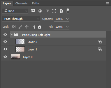
Having run the action in Photoshop, you will be left something like this.

[REWIND: HOW TO CREATE PHOTOSHOP ACTIONS THE RIGHT WAY SO THEY WORK EVERY TIME]

frequency-separation

Here’s a quick rundown of each layer:

High Copy – This is where you do the blemish removal.
High – This layer acts as a copy of the above layer. It comes in very useful if you make a mistake while editing the top layer.
Color – On this layer, you can edit the color of the skin using a soft brush
Luminosity – Surprisingly enough, on this layer, you can edit the tones within the skin. I tend to do this using dodge and burn these days but you can do it here if you prefer.
Low – This is where I, and others, used to edit the tones and color. Nowadays, I find it much better to use the two blank layers in between. It gives you so much more control.

Frequency Separation | Removing The Color Cast

The process of actually removing this color cast is very simple. First, select the “Color” layer. With a soft brush, set to a low flow, sample a color you want. I like to sample as close to the area I am correcting as possible. Then, paint over the nasty stuff. Continually sample and paint. The skin has subtle differences in color, so it’s important to sample multiple times. Painting one colour over the whole area would end up looking odd. It’s for this reason that the Hue and Saturation technique doesn’t work too well sometimes.

That’s it! How amazingly simple is that? The complex bit is setting it all up but if you use the action, it should only take you a moment. Remember, if you’d prefer, you can also simply create a blank layer, change the blend mode to Color and paint on that. If you opt for this route, however, you don’t get all the added benefits of Frequency Separation. For me, if I deem a portrait deserves the time that Frequency Separation takes, I always start with it first. I use it to remove blemishes and correct color. I’d then move on to using dodge and burn to adjust the tonality across the face.

My last step on this image was to add a burn layer and darken down the cheek a little. By altering the color, to my eye, it made that side of the face appear lighter (even though it wasn’t).

BEFORE:

frequency-separation-correcting-skin

AFTER:

how-to-use-frequency-separation


Photoshop and Lightroom Image Resizing Resource Guide

$
0
0

In case you haven’t noticed, I’ve written a few articles about re-sizing images lately. They were all written with this comprehensive guide to resizing images in Photoshop and Lightroom in mind. I originally set out to write this guide and realized we were missing some important basics. Now that those are covered, here’s your Photoshop and Lightroom image resizing resource guide, featuring links to articles covering most everything you could ever need to know on the topic.

How to Resize Images in Photoshop

RESIZE PHOTOS IN PHOTOSHOP | THE 5 MOST COMMON METHODS

how-to-resize-image-photoshop-image-size1

Follow step-by-step instructions with screen shot examples in this tutorial, where I cover the five most common methods for resizing images in Photoshop, which include:

  • Crop
  • Image Size
  • Canvas Size
  • Save for Web
  • Export As

HOW TO BATCH RESIZE IMAGES IN PHOTOSHOP IN SECONDS

In this tutorial, I show you how to batch resize images using an image processor script. I later learned from a community member that there’s a pro version of this script, which gives you more options for resizing. You can download that action on the Adobe blog.

HOW TO CREATE PHOTOSHOP ACTIONS THE RIGHT WAY SO THEY WORK EVERY TIME

how-to-create-photoshop-actions

You can also batch process images using an action in Photoshop. In this tutorial, Max shows us how to create actions the right way, so they work every time. I, myself, have not tried resizing with an action, but if you frequently resize images in Photoshop to specific sizes, for a blog, or example, it would certainly save a lot of time.

RESIZE AND SHARPEN YOUR IMAGES FOR THE WEB USING PHOTOSHOP INSTEAD OF LIGHTROOM

In this article, Anthony shares the below video, as well as screenshots and a summary of the video. Steve Perry shows us his method for sharpening and resizing images for the web in Photoshop without losing detail from compression. He also explains why he chooses to resize and sharpen images for the web in Photoshop instead of Lightroom.

How to Resize Images in Lightroom

THE 9 BASICS OF EXPORTING IN LIGHTROOM

export-images-lightroom

In this tutorial, Pye explains the nine basics of exporting in Lightroom. The article is an excerpt from the Lightroom Organization and Workflow DVD, the first DVD of the Lightroom Workshop Collection. Designed to give photographers a ground up foundation in the Lightroom catalog system, image management and organization, Lightroom customization and much more, these tips will increase the speed of your processing by 5 to 10 times.

The SLR Lounge Workshop helped me speed up my workflow drastically, and I even developed my own editing style after using the Lightroom Preset System. It saves me so much time!

HOW TO CREATE A PRINT-SIZED IMAGE EXPORT PRESET IN LIGHTROOM

Here’s another excerpt from our Lightroom Workshop Collection. Pye shows us how to create a print-sized export preset in Lightroom. These presets are actually included in the latest version of the Lightroom Presets, which is one more way the Preset System saves you time.

HOW TO CREATE A WEB-SIZED IMAGE EXPORT PRESET IN LIGHTROOM

After you create your print size exports, you’ll probably want a web-sized preset, too. You can create one for any size you want, actually. I’ve created one for Facebook, blog, SLR Lounge articles, print, etc. so when I’m exporting I don’t even have to think about numbers, I just click on the preset in the menu, choose the location where I want it to be saved and press the export button. Viola!

The Many Faces Of Frequency Separation. Are You Doing It Wrong?

$
0
0

how-to-use-frequency-separation

In some of my recent articles, I’ve talked about an editing technique that I love, despite having become the bain of some photographers’ existence. It’s Frequency Separation, and it’s a technique that has been around for a long time. I started using it years ago and have changed my methods dramatically since then. There are so many videos and articles explaining this technique, but few of those tell you the correct way of doing it, nor delve into the philosophy that I feel is key. The result of this is a large number of photographers ruining their images. This article hopes to fix some of that.

[REWIND: REMOVING TRICKY COLOR CASTS ON SKIN + FREE FREQUENCY SEPARATION ACTION]

Brief Explanation Of Frequency Separation

As mentioned, I have spoken of this before so will keep this brief. Frequency Separation is the process of isolating the details of your image from the colors and tones, thus allowing them to be edited separately. The main benefits of this are that it becomes far easier to retain detail when doing in-depth edits and you have very precise control over color and tone.

Frequency Separation has, however, attained a bad name amongst many due to the way it is used. Simply put, people either do it completely wrong or they go too far. Our aim when using Frequency Separation is to create NATURAL looking, flawless skin (up to you how flawless). Ironically, by going too far, we get the opposite effect. When skin is too perfect, it ends up resembling plastic and loses its detail.

[REWIND: SKIN RETOUCHING | NO MORE PLASTIC SKIN…PLEASE]

An important point to note is that you DO NOT need to use this method on every image. Firstly, it takes some time when done correctly, and as such, it is simply not practical. Secondly, if we are operating within what I would call the “correct skin retouching philosophy,” then it is not necessary all the time. I’ll cover the philosophy side of things a little later.

Setting Up Frequency Separation In Photoshop

Rather than go into detail on how to set this up, there are quite a few steps, please download my own personal Photoshop action. You can find it here. This action will create all the layers you need and has some short explanations along the way. Please note, there are two separate actions that must be used depending on what bit-depth you are working in (8 or 16).

frequency-separation-how-to

Once you run the action, you will be left with the layers you see above. As I said, everything is explained throughout the action, but there are a couple of things I would like to draw your attention to.

1) The “High Copy” layer is where you do all your detail editing. By working on this layer, you always have the “High” layer as a backup should you do something wrong
2) On the “Luminosity” layer, you would adjust the tones using the brush settings I advise in the action. However, it’s better to do this via some Dodge and Burn layers. Why? It’s more flexible and a little less destructive than Frequency Separation. Either method is ok, but I prefer to adjust Luminosity via Dodge and Burn.

The Many Faces Of Frequency Separation

So why has this fantastic editing method become so confused? Over the years, I have watched a lot of videos about this technique. I have gone from using it the wrong way (what I classify as wrong) to a more refined version. Frequency Separation has been sold to us incorrectly as an all-encompassing wonder technique, which is perfect for everything. Due to this, it’s become very popular. When something becomes popular everyone wants to create videos on it and write articles about it (like me). Sadly, many of these people do not know what they are doing and as a result, there has been an avalanche of misinformation.

Of the numerous videos I have watched over the years, they all start the same. The setup is usually the same. The best videos include a few extra steps; adding layers in between (Colour and Luminosity in my action) and have different techniques for working on the low layer; something that I now never do. All in all, there are two methods that I classify as correct.

In this video by Phlearn, Aaron Nace takes us through the more common version of the technique. As you’ll note, the setup is the same, but the key difference between this and what you will see below is how you work on the layers created. Aaron uses the Lasso Tool to select an area and then blurs that area using a Gaussian Blur. This has the effect of smoothing the transitions between the tones. This works and technically there is nothing wrong with it but, for me, it’s not giving us enough control. Doing it this way also has the added negative of very easily creating the plastic fantastic look that I (and most others) agree is not desirable.

[REWIND: PHOTOGRAPHY COURSES: 5 ESSENTIAL COURSES FOR EVERY BEGINNER]

This is the method that I used for a long time, and I got some pretty good results with it. I even developed my own version that was used when time was very tight; a method that would have retouchers shouting at their screens. Essentially, I duplicate the Low layer, add a Gaussian Blur and then selectively paint the effect on using a layer mask. This is not something that I advise you doing, but it just goes to show how many different ways this technique can be used. The big negatives of doing it that way are the lack of control and high risk of making someone look very plastic-like. However, used with an extremely light touch, I’m able to create some decent images. You may recognize the one below from a previous article where I used this method.

How-to-do-frequency-separation

The next version of this method is shown in the following two videos by Michael Woloszynowicz and Julia Kuzmenko Mckim. Again, the main difference is the way the retoucher’s work once the layers are created. Rather than using the Lasso Tool and blurring, in these videos, you will see the brush tool being implemented. In my opinion, this technique is far superior as it allows you much greater control. In addition, you’ll see the extra layers being added in-between the High and Low layers. These added layers make the whole technique much more flexible. It’s far easier to go back and change your adjustments, AND we can use blend modes to be even more precise.

The Philosophy of Frequency Separation

This section is perhaps the most important part of this whole article. I absolutely love Michael Woloszynowicz’s editing style. Full credit goes to him and his videos for showing me how to correctly use this technique. Not only that but he has also spoken about the fact that he, too, overused this method, to the point where he ruined some of his old images.

Whenever retouching skin, you need to consider your aims. If it’s beauty retouching, then you will want a particular level of perfection whereas fashion, headshots, or portraits will be another. The overriding philosophy is to create something that appears to be natural. With beauty, it will undoubtedly be more “perfect”, and thus it could be argued to be less natural but either way, we want to retain detail, not destroy it, and produce something with a healthy appearance. Go into every edit knowing that:

1) You have Frequency Separation within my editing arsenal
2) It is not always appropriate to use and must be done with a light touch
3) Not every image needs to be “flawless.” ONLY use this when necessary

These days, when I need Frequency Separation, I will use one of the methods mentioned throughout this article. More often than not, I am working on images that either do not require it or are not paying me enough to devote the time. It’s so important, as professionals, to draw that line and make that distinction. The majority of my images are edited in Lightroom using the SLR Lounge Preset System and then taken over to Photoshop only if necessary. If you are on the hunt for a decent system for Lightroom, then I cannot recommend it enough. You can find the SLR Lounge Preset system in the store here.

The Full 2016 Adobe Shortcuts For Photographers Cheat Sheet

$
0
0

adobe-cc-photoshop-lightroom-shortcuts-cheatsheet-photography-slrlounge-kishore-sawh

How many programs (is that word too last century?) do you use on the regular to accomplish all the various tasks you handle on your computer? A word processor, a spreadsheet manager perhaps, maybe some internet project management application system, and that’s all before you get to your photography work. Add that in the mix and you could very well find yourself doubling you application list.

Even if you are a laser-focused photographer that scoffs at the moving image, at the very least you’re using, I’d reckon, two highly complex programs, both likely from Adobe. And if I were a betting man, I would say probably Lightroom and Photoshop – the stone pillars of the photographic organization and post processing world. But to use these applications efficiently there requires some knowledge of shortcuts, and unless you’re of a Rain Man persuasion, that’s a helluva lot of them to remember. Never mind the fact Adobe released a rather gargantuan overhaul to their suite of creative apps halfway through the year, which saw many cosmetic and functional changes, including the shortcuts.

adobe-cc-photoshop-lightroom-shortcuts-cheatsheet-photography-slrlounge-kishore-sawh-2

So to assist our feeble, overloaded, and during the holiday season, possibly alcohol- disabled brains, a shortcut cheat-sheet for the 2016 variants of Lightroom and Photoshop would be much appreciated. And wouldn’t you know it, makeawebsitehub.com has once again come to our aid by releasing just that.

[REWIND: Possibly The Best Lightroom & Photoshop Cheat Sheets – For Free]

You can find them below, and the wonderful thing about them is that it isn’t just a long list of shortcuts, but a categorized one, which makes searching, finding, and implementing them much more practical. Within Photoshop, there are Image Command shortcuts, and those for Filter, 3D, Layers, Select Commands, Tool selection and actions, and so on. For Lightroom, it’s even more subcategorized with sections dealing with certain modules, metadata shortcuts, changing views and screen modes, comparisons, ratings, and even for using a second monitor – which if you want to check out a cool app for that which will transform your iPad and workflow, check Duet out, here.

adobe-cc-photoshop-lightroom-shortcuts-cheatsheet-photography-slrlounge-kishore-sawh-3 adobe-cc-photoshop-lightroom-shortcuts-cheatsheet-photography-slrlounge-kishore-sawh-4

There are actually Cheat Sheets too for the rest of the Creative Suite from Adobe, which you can find in this previous post, but go ahead and download the PDF versions of these cheat sheets for Lightroom here, and Photoshop here. And give some love to MakeAWebsiteHub.com for creating this and dishing it out sans cost.

Photoshop Tip | Split Your Screen For One Image To Maximize Efficiency

$
0
0

I’ve come to realize over the course of my relatively short and fortunate life, that often I don’t know what I want until I’m given it. That has been true in my dating life no doubt, but in education, too. In fact, it’s not really just about wanting, but about suitability and a better way of doing things, and in that sense, I run into this issue during my retouching all the time.

As Photoshop has developed over time, its processes have become ever more clever, and features more robust, and the list of features ever longer. Frankly, I can’t keep up with it all nor could I remember them all if I did. So, it may be a large assumption but I’m rather certain this holds true for many of you also, and I’d like to bring you all a few of the things I feel you’ll want and may not yet know you do. Here’s the first:

photoshop-tutorial-split-screen-monitor-zoom-editing-skin-photography-slrlounge-kishore-sawh-6

If you’re retouching in Photoshop, and you’re zeroed in and doing local adjustments versus global, you’re more than likely going to be zooming in a lot. If you’re doing skin retouching, for instance, you’re likely going to be living at 100% or even more for much of the time. The problem inherent to this is that you can become so engrossed in the precise portion you’re working on, you can’t get a feel of how it’s all meshing with the overall picture – losing the forest for the trees, and all that. As such, you may find yourself zooming out, taking a look, taking note, and then zooming back in to adjust. This is typical, but there’s another option to save a lot of that.

Using dual monitors is what you’re thinking? No, not quite, but you will be maximizing the one you do have. Photoshop has the ability to take your image, essentially duplicate/mirror it on screen, and sort of allow you to work on the image (in either frame) and see the effects within the other. So, how I tend to operate is to set it up, have one panel showing the image in its entirety, then in the other, I’ll be doing the retouch work at 100% or more. It gives me the best of both worlds as I can do my micro level work, and also see in real time how it’s affecting the image on a macro scale.

Here’s how to get it up and running:

Step 1: Open Your Image In Photoshop

Open your image in Photoshop either from Photoshop’s menu, dragging and dropping, or from Lightroom, whatever suits.

Step 2: Duplicate Your Image

At the top of your screen from the Menu bar, go to Window > Arrange > New Window For [whatever your filename is]. As you select this, you will immediately see a second tab showing your duplicated/mirrored image.

photoshop-tutorial-split-screen-monitor-zoom-editing-skin-photography-slrlounge-kishore-sawh-3

Step 3: Set-Up For Your Orientation

It’s entirely your prerogative which orientation you choose, but I tend to choose whatever orientation the image what shot in so you see the screen split equally, and neatly. So, head back up to the menu bar, then to Window > Arrange > 2-Up (Vertical or Horizontal). 

What should now have appeared on your screen is something resembling the screenshot below, where you’re looking at 2 identical images side by side or atop one another.

photoshop-tutorial-split-screen-monitor-zoom-editing-skin-photography-slrlounge-kishore-sawh-4 photoshop-tutorial-split-screen-monitor-zoom-editing-skin-photography-slrlounge-kishore-sawh-2

Depending on your Photoshop setup, in order to control each independently in terms of movement and zoom, you’ll need to ensure that the box marked ‘Zoom All Windows’ is unchecked, otherwise what’s done to one in terms of zoom will be done, clearly, to the other, defeating this particular purpose. Once unchecked, you will be able to maneuver them independently. That’s it really; it’s that easy. Just test it out by grabbing a brush, making an adjustment on one, and you’ll see it (the adjustment, not the brush) appear in the other side.

photoshop-tutorial-split-screen-monitor-zoom-editing-skin-photography-slrlounge-kishore-sawh-5

photoshop-tutorial-split-screen-monitor-zoom-editing-skin-photography-slrlounge-kishore-sawh

[REWIND: HOW TO MOVE IMAGES FROM ONE LIGHTROOM CATALOGUE TO ANOTHER]

Of course, this is simply to show you that this option exists, and you can do with it what you like. Sure it’s not the biggest gun, but one worth firing.Hopefully, this will serve you well in saving time, and allow you to work more without breaking flow and concentration. But I don’t need to sell the idea to you, as I’m sure you’ll see its merits. After all, ‘dope’ sells itself.

How To Retain Your Edits Made In Adobe Camera Raw When In Lightroom

$
0
0

ACR-lightroom-camera-raw-tiff-psd-xmp-files-photography-slrlounge-kishore-sawh-8

If you’re a part of the SLRL family, and our site is somewhere you frequent, I’m going to take a wild stab in the dark and say that so far as post-processing and file management goes, you live in and around Lightroom. And if it is Lightroom you use, you understand that in order to get the most out of it, and the least headache, there is a certain path to take from the moment of import from memory card to your computer.

Some go directly into LR and others, like myself, create a Folder on my drive in which the images will go in, and the .LRCAT file, since I have a different catalog per shoot. Now, what’s consistent here is that Lightroom is the first application your images find themselves. From there, we’ll browse, cull and, edit and if we come upon an image that requires retouching beyond the scope of Lightroom, then we right click and ‘Edit In’ Photoshop etcetera. That keeps things organized, and any adjustments we make in Photoshop then get carried back into LR.

wacom-intuos-pen-touch-tablet-retouching-lightroom-wedding-portrait-photography-slrlounge-kishore-sawh

However, there may be instances where you will work on an image in Photoshop or Camera Raw (maybe you have some great presets or something) before you later import it and the bulk into Lightroom. Perhaps you don’t have the time to wait for LR to build the full previews, you typically do upon import, or maybe a client needs an image immediately, or maybe you’re just going back into old files that aren’t in any LR catalogue to pick one out to edit. Whatever the reason, if you’ve made some changes in Camera Raw and then later bring those edited files into LR, you’ll want those same changes carried over, and it’s quite simple how.

Seeing Your Edits From Camera Raw When You Open The Image In Lightroom

When you edit in Camera Raw, it typically will have those changes saved within an XMP file that is associated with that image. That file is just a little footprint of the changes done to the image, and if you were to delete it and click on the same image, the adjustments wouldn’t be there. When it’s created, it’s typically created and organized right with your raw file so it shouldn’t be hard to find. That said, you can choose within Camera Raw whether you want to use the XMP file method or have those changes saved in a central database, but more often than not, people use the XMP file.

ACR-lightroom-camera-raw-tiff-psd-xmp-files-photography-slrlounge-kishore-sawh-2

ACR-lightroom-camera-raw-tiff-psd-xmp-files-photography-slrlounge-kishore-sawh-3

If you want LR to show those same edits when you eventually put them in, just ensure that file is within the same folder as the image file that’s being ‘imported’ or ‘added’ to Lightroom. You will see all your changes will have carried over as the XMP file data will have been applied.

Now, if you’ve made your edits in CR and hit ‘Done’, the XMP file will be created but your Raw file will be left saved as it was originally. For example, if you open that file in Apple’s Preview, you won’t see the adjustments because it doesn’t associate the XMP file with the Raw. As such, should you delete the XMP file, your changes will have gone. If you want to see the adjustments, you’ll have to hit ‘Open Image’ and save it as another file type, like DNG, TIFF, PSD, or whatever.

ACR-lightroom-camera-raw-tiff-psd-xmp-files-photography-slrlounge-kishore-sawh-4

On a side note (sort of), since we do a lot of this moving around of images between ACR, Photoshop, LR, we can end up with various file types in one catalogue. If you are working in LR and you want to see all the files that you’ve worked on in ACR or Photoshop, just filter it through the metadata. So within the Library module, click on Metadata and ‘Add Column’ (see above image) and select ‘File Type’. This way, you can see any other file types stored, such as in this case out of 149 images only 1 have I worked on in Photoshop. It’s handy to see what I can delete or may want to keep.

ACR-lightroom-camera-raw-tiff-psd-xmp-files-photography-slrlounge-kishore-sawh-5

ACR-lightroom-camera-raw-tiff-psd-xmp-files-photography-slrlounge-kishore-sawh-6

[REWIND: HOW TO SET-UP YOUR WACOM INTUOS PEN TABLET FOR LIGHTROOM]

This is certainly not an issue for everyone, but certainly frustrating for some, and it’s good information to have in case. If you like getting a glimpse into the depths of LR, and want to take advantage of software you’ve already invested in and save time and headache, might I then suggest looking around our site for more like this, and if you really want to become an expert and fast, then look into the Lightroom Workshop Collection – there’s no better LR educational source.

How to Replace a Backdrop in Photoshop in 3 Minutes

$
0
0


Sometimes the plain backdrop in the studio just does not cut it, so today I want to show you how to replace a plain backdrop with a gorgeous, intricate, hand-painted backdrop in minutes.

You would probably recognize this look from Annie Leibovitz’s portraits who uses hand-painted backdrops as her studio’s signature look.
Sadly, those backdrops are not cheap; a good one will set you back about $350 for a one-week rental. Luckily, we can use a digital backdrop that will only cost you $20.

The good thing about the digital backdrops is that they are not digitally rendered but were shot using various lighting conditions so you can select the one that fits your shoot. It only takes about 3 minutes if you select the right backdrop.

There are currently five options to choose from: Feathery Brown, Dark Brown, Deep Blue, Rusty Grey & Decayed White. They are all photographs of actual hand-painted backdrops, so they show an incredible amount of detail and transitions.

verena_backdrop_02

Usually, the hard part with such an overlay is the masking, but if you select a backdrop that is in the same neighborhood as your subject’s skin (and all browns and grays will work for that matter), masking becomes trivial.

Before:

backdrops-sample-before

After:
backdrops-sample-after

[REWIND: Check out our Photoshop Paper Textures here]

Here is how its done:

  1. Start with a photo shot against a white or gray (or other neutral backdrop)
  2. Place a background over the photo with a white or gray background
  3. Set the layer blending mode to soft light
  4. Apply a layer mask and mask out the general figure using a hard brush. You don’t need to be very precise; just make sure you don’t mask out the backdrop.
  5. Now set your brush to about 20% flow and even out the transitions created by the hard brush. The blending mode will take care of the edges, so there is no need to be extra precise.

verena_backdrop_04

Since the time-consuming part is the masking and we made that very easy, the backdrop can be replaced in two or three minutes.

If you want to try this out, you can use any of these practice files along with one of the digital hand-painted backdrops packages from the Image Manipulation Store.

2 Tools That Open The Taps On Lightroom’s Develop Module & Presets

$
0
0

Developing with Lightroom is a different art to Photoshop in pretty much every respect. Whereas to work within Photoshop properly, it demands you understand how it thinks and does what it does; with LR you simply intuitively do. Except that’s not really the case, because the depths of Lightroom that you won’t really just learn through trial and error, the parts not so intuitive, is where some of the best stuff can be found. In the coming weeks, I’ll be going into more depth on how one can setup and use LR for a more tailored experience beginning now.

wacom-intuos-pen-touch-tablet-retouching-lightroom-wedding-portrait-photography-slrlounge-kishore-sawh-4

If you’ve read any of the thoughts I brain vomit onto the pages here at SLRL, you may have picked up that whilst I use, like, and think highly of Lightroom, I’m a Photoshop guy at heart. The type of work I tend to enjoy isn’t batch working on a wedding, but rather picking a few shots per shoot and making each of them tuned to my/client’s very liking. I’m used to Photoshop, and even with its changes and weird new startup current-file look, opening and setting it up is like greeting an old friend.

Lightroom’s organizational capacity with catalogs and so forth has always been its strongest point with me and for many, which is probably why Capture One has adopted that structure of late. However, Lightroom’s Developing ability has sort of hit maturity and come into its own in the past year or two. Enough, anyway, for me to spend a significant amount of time with and within it. There are two features I use within Lightroom that (and I’m not exaggerating here), revolutionized Lightroom for me: Snapshots and the SLR Lounge Preset System, which gets even better when using the tools below.

Snapshots

Absolutely one of the most underused and under appreciated features in Lightroom, and the only reason I can imagine for many to treat Snapshots like a leper is that there’s a lack of understanding of how they can be used. So here’s the breakdown that’ll show you how to use it, and illuminate why it’s so essential to LR developing.

lightroom-fader-slider-develop-snapshot-tutorial-slrlounge-shotkit-photography-kishore-sawh-13

Snapshots is a tab you’ll find within the Develop Module, and can be somewhat associated with the History tab, which is, no doubt, something you’re all aware of. Much like in Photoshop, the History in Lightroom is a trail of digital footprints of processes you’ve done to your image, and each of those steps can be retraced and reverted to.

Alone, it’s already a wonderful thing to have so you can, with but a click of the mouse, return to a preferred image some 10 processes ago. However, adjustments in Lightroom can be fast and frequent, and the history simply displays a change with rather banal notification that will say something like, “Update Highlights Adjustment,” or “Add Graduated Filter.” This doesn’t exactly tell you much when you’ve got a list of changes as long as The Orient Express. So what to do? Well, use Snapshots.

lightroom-fader-slider-develop-snapshot-tutorial-slrlounge-shotkit-photography-kishore-sawh-15

Simple photo of my breakfast, with minor adjustments

lightroom-fader-slider-develop-snapshot-tutorial-slrlounge-shotkit-photography-kishore-sawh-16

Just a sampling of the adjustments made to see how many there are and the banal naming

Think of a Snapshot as taking one of those digital footprints, digging it up and storing it in your closet for you to go back to easily. They allow you to quickly reference a version of your image with edits, that you store to go back to whenever. Simply, when you’ve come to a point in your developing where you feel you like the image, Snapshot it, then you can continue to work on it, and if 20 moves later you don’t like what you’ve done, you can revert to the point you liked and saved as a Snapshot.

Before I learned to use Snapshot, I would often make Virtual Copies of the same file and edit it, but this means I don’t always have to, and it doesn’t duplicate any images either so there’s no computer power penalty. And it’s dead easy to make one, as you simply make the edits you like, click the little add sign on the Snapshots bar, and a dialogue box will come up for you to rename your Snapshot. It works alphabetically so you may want to keep that in mind, but LR as a default gives you the date and time the edit, and I tend to just use that.

In this example, I used this image of my little cousin in the living room, edited it, applied a b&w preset and liked it, made a snapshot of it, then made some other changes. To go back to it, all it takes is a single click within the Snapshot bar.

lightroom-fader-slider-develop-snapshot-tutorial-slrlounge-shotkit-photography-kishore-sawh-12

Image with edits made to where I like it but wanted to try B&W

lightroom-fader-slider-develop-snapshot-tutorial-slrlounge-shotkit-photography-kishore-sawh-11

Image with B&W and some other adjustments, saved as Snapshot

Removing The Bottle Neck From Your Presets with Fader

Let me be clear here that I currently use and own our Preset System, and all those of Mastin Labs, and some VSCO. In order of preference, it used to be Mastin Labs, SLRL, VSCO, because Mastin had those great light-touch film looks, but now we’ve added those too. Though I still find the Mastin Labs Ilford B&W to be my favorite b&w presets, period. The true benefit of the SLRL Presets is that it’s a system that allows for predictability, congruency, and personalization. It’s the thinking man’s Preset system.

lightroom-fader-slider-develop-snapshot-tutorial-slrlounge-shotkit-photography-kishore-sawh-7

But, and it’s a big one, I find using VSCO presets on my iPhone to be my favorite way to use presets simply because I can tone down the level of the preset in its entirety, essentially allowing me to apply the preset as I would opacity in Photoshop. It’s just not that easy in Lightroom because you have to go into individual sliders and adjust each, and sometimes I just want a preset but in a lighter variety. To the rescue came a friend, Mark Condon, founder of ShotKit, which I wrote about some two years ago now, when he suggested The Fader from Capture Monkey.

lightroom-fader-slider-develop-snapshot-tutorial-slrlounge-shotkit-photography-kishore-sawh-8

What is it? It’s literally a preset opacity slider plug-in for Lightroom, and it has opened up the taps on the SLRL Preset System. With it, one is able to achieve the subtle, or emphasized look of all the presets without fiddling with numerous sliders, and using just one. It’s extremely simple to use, and it’s free. Download it, install it by going to Lightroom, File>Plug-In Manager then Add Plug-In. In use, click a preset you want, and then to go File>Plug-In Extras>The Fader and then use the presented slider until you have the desired effect. It’s brilliant.

lightroom-fader-slider-develop-snapshot-tutorial-slrlounge-shotkit-photography-kishore-sawh lightroom-fader-slider-develop-snapshot-tutorial-slrlounge-shotkit-photography-kishore-sawh-2

Example In Use:

lightroom-fader-slider-develop-snapshot-tutorial-slrlounge-shotkit-photography-kishore-sawh-9

Image as shot

lightroom-fader-slider-develop-snapshot-tutorial-slrlounge-shotkit-photography-kishore-sawh-5

Image with preset applied – too heavy

lightroom-fader-slider-develop-snapshot-tutorial-slrlounge-shotkit-photography-kishore-sawh-4

Fader used and preset opacity reduced to desired level

[REWIND: 3 Things To Improve Your Photography Results For Little To No Money]

If you like this, you can check out Mark’s book, Lightroom Power User, which is chock full of great LR tips sure to have something for users at every level to hone your LR flow and give you some of those ‘ah-ha!’ moments. And if you really want to get into the bowels of LR for some truly in-depth and easy to digest learning so you can wield LR like you invented it, the Lightroom Workshop is what you have been looking for. Get the Fader here.


Color Grading In Photoshop | 5 Ways To Manipulate Color

$
0
0

Photoshop is the dog’s bo****ks. Apologies. I recently re-watched Snatch and Lock Stock – two of the best films made over the last two decades – and have subsequently become a little loose with my language.

Joking aside, it really is, but it can be a fairly daunting place to venture when you know s**t-all about it. Similar to being shown around a pig farm by an eccentric British gangster as he explains the best way to dispose of bodies. Actually, it’s nothing like that, but the films deserved another reference.

One of the reasons Photoshop is so daunting is the seemingly never ending number of things to learn. On the other hand, that’s also why it’s so great. To help you along with your Photoshop education, I’d like to take you through 5 of my favorite ways to edit color.

using-Hue-and-saturation-to-color-grade-in-photoshop

Color Grading In Photoshop |  Hue And Saturation

Almost all of the tools I’ll be mentioning here can be used for the same purpose. The main difference is the way you get there. By that, I’m referring to their interfaces and the control that each tool gives you. It’s often the level of control which will affect how and when I use a particular tool.

I’ve already written an article about one way I use Hue and Saturation, which you can find here. In that article, I talk about using it to correct or unify skin color. The same (or opposite) can be done when editing any color in your images. The technique is rather long (please read old article here) but it essentially involves selecting the color to edit, refining that selection using the slider at the bottom of the panel, and then adjusting the color using the controls available: Hue, Saturation and Lightness.

[REWIND: RETOUCHING IN PHOTOSHOP | CORRECTING SKIN WITH HUE & SATURATION]

I use Hue and Saturation as a quick and easy way to edit pre-existing colors, and, in conjunction with masks, to quite drastically change a particular color. For example, I recently changed the color of some petals using Hue and Saturation. The beauty of Hue and Saturation is it’s easy, and it has that nifty slider at the bottom. The usefulness of that slider cannot be underestimated. It’s great for making quite precise alterations, especially with skin.

photoshop-color-grading

Color Grading In Photoshop | Selective Color

Selective Color has become one of my favorite ways to gain very precise control. I use it mostly for correcting color casts and for actual color grading. I love the level of control it provides. For the purpose of demonstration, I used Selective Color to remove the red shades in the fog, to the right of the frame and make it seem closer in color to the fog on the left side of this image. By simply heading over to the red channel and using a very basic mask, I was able to alter the color in seconds.

color-grading-photoshop

The benefit of Selective Color, compared to any other method, is the level of control. As a result, I find it much more enjoyable to use for color grading. Hue and Saturation is a little too basic for me in this regard and hence, is better suited to the other tasks mentioned above. By clicking on the colors drop down, we are given six color options to adjust, as well as the highlights, shadows and mid-tones (whites, blacks, and neutrals). In each one of those channels, we have full control over how much red, green, blue (plus their complimentary colors) we add or take away.

selective-color-grading-photoshop

So, if I love the control of Selective Color so much, why don’t I use it all the time? Simple, it’s a little too time consuming. As you become more familiar with the tools in Photoshop, you’ll realize the limitations of each and which one is best utilized to save time. There are moments when only Selective Color will do, but usually, I revert to something a little quicker. The other reason I may opt for Hue and Saturation, over Selective Color, is the selection slider at the bottom.

Color Grading In Photoshop | Curves And Levels

And now we come to what so many would consider the holy grail within Photoshop. They kind of are, but there are so many other tools that get overshadowed by their dominance. In terms of color, I group them together as they are essentially the same with different interfaces. I prefer the layout of curves, and so I will usually work from there.

color-grading -with -curves

Looking at the photo above, I’ll explain it from the top down. The first arrow you see is our channel selection. Click on that drop down menu and you can edit the reds, greens or blues. Moving the line up will add the color you are working on, whereas moving it down will add the opposing color on the color wheel. For example, if we are working on the blues, up will add blue and down will add yellow.

[REWIND: A QUICK WAY TO CORRECT SKIN COLOUR FOR A HIGH-END LOOK]

The second part you must understand with curves is the histogram. All you need to know is that the right side depicts the highlights of your image, and the left shows the darks. Everything in the middle is the mid tones. Therefore, if we want to add blue to the highlights, we would move the line up on the right side. Or if we want to add blue to the shadows, we move the line up on the left side.

how-to-color-grade-photoshop

At first glance, Curves does appear complex, and it can take a little getting used to, but once you get your head around it, you’ll find it’s quite simple. The differences compared to Selective Color, for instance, are that we are only editing the colors within the Highlights, Shadows, and Midtones. We cannot select an actual color and alter the appearance of that throughout our photo. There is nothing wrong with that but it doesn’t give us the added control that Selective Color provides. Despite this, I often find the level of control provided by Curves is more than enough; it’s relatively fast and intuitive. Thus, I regularly utilize it for color grading images.

Color Grading In Photoshop | Photo Filter

I don’t tend to use photo filters very often. Nonetheless, they are another useful tool for neutralizing color casts, perhaps one of the best, and they can be used creatively in other ways.

color-grading-photoshop-filter

We can either select one of the presets from the filter drop down menu or choose “Color” and select our own (see photo below). Having found a colour you find pleasing try double clicking on the layer and using “blend if” to refine the area of your image the effect is applied to. Take a look at this tutorial where I talk in depth about the use of “blend if” for dodging and burning. The same method can be applied to color AND to any of the tools I have already talked about.

[REWIND: DOWN & DIRTY DODGE AND BURN TECHNIQUE USING ‘BLEND IF’]

color-grading-photoshop-blend-if

Color Grading In Photoshop | Painting

One of my favorite methods, perhaps because it makes me feel more like an artist, is to paint color onto a blank layer using the blend mode “Soft Light.” By having the layer set to soft light, none of the detail in the image will be lost.

color-grading-in-photoshop-using-a-paintbrush

Rather than adding totally new colors, I usually use this technique to accentuate what’s already there. With this photo, I wanted to exaggerate the difference between the left and right of the frame, specifically the reds on the right and blues to the left. To do so, I selected the colors I wanted to add by using the color picker tool. I then added a little more saturation to each and applied a gradient to two separate layers so that they could be adjusted individually. Finally, I used “blend if” to refine where these colors would be present and ended up with the image below. It’s a little extreme for my taste, but as you can see, the method still produces natural looking results.

[REWIND: HOW TO REPLICATE THE COLOR PALETTE FROM ANY PHOTO OR FAMOUS PAINTING IN SECONDS IN PHOTOSHOP]

color-grading-photoshop-5-techniques

Summary

As I have demonstrated, there are many ways to arrive at the same place in Photoshop. Give each one of these tools a try and over time, you’ll come to realize which you prefer to use, and which is appropriate to use.

*Side note – I am always using masks and blend if to refine whatever I apply.

Photoshop is perfect for when you want to get heavily into a photo. It’s not always necessary though and can end up being a giant, time-wasting, rabbit hole. Make sure you’re prepared before you jump down it! Lightroom, on the other hand, is an indispensable tool that is useful for every job. Make sure you check out the SLR Lounge Preset System to speed up your workflow. You can find it in the SLR Lounge Store, here.

How To Create a Double Exposure Image In Photoshop

$
0
0

French photographer Boris Untereiner was first exposed to double exposures when he was ten-years-old. His father showed him some slides of images of his mother blended with landscapes or various objects. His father explained the process of how he created a double exposure and today, Boris is inspired to create images like those he saw many years ago.

Of course, in the digital age, the process of creating a double exposure is quite different from his father’s days of film. The concept is the same, but the execution is very different. It is also less expensive these days, and the options are limitless. Boris has been working on his double exposure series for three years. Here are a few of his images:

_MG_0104

_MG_0245 _MG_8911 _MG_8940b

_MG_8998

The process, Boris explains, is done in Photoshop and only takes a few steps.

doubleXposure_howto

[REWIND: USING REFLECTIONS TO CREATE A DOUBLE EXPOSURE ILLUSION]

First, Boris takes a picture of his model, making sure the light has clearly defined light and dark areas. “A flat light would lessen the effect,” he says. He lights the background using a flash so that it is completely white.

01

In Photoshop, Boris changes the image to black and white and adds contrast while keeping a range of gray tones on the model. He does this with the Nik Software Silver EFX plugin. He will then add a bit of noise for texture.

02

This next step is “where the magic begins,” according to Boris. He imports the second image onto a new layer on top of the first image.

03

He then changes the blending mode of the second image layer to “screen” and adds a layer mask to the second image. He paints the parts in the picture he doesn’t want the effect to appear with a black brush.

layers

03b

Next, Boris adds a levels adjustment layer and creates a clipping mask between this layer and the adjustment layer of the second image. He uses the white picker tool and clicks on the “yellowish area of the second image” to indicate the colors are white.

04

Finally, Boris concentrates on the details. He will slightly warm the medium and dark tones with a photo filter layer and will complete the image on a final layer where he fixes any remaining issues with the spot healing brush and clone stamp.

Final Image

05


You can see more of Boris Untereiner’s work on his website here.

How Much Do You Know About Masking In Photoshop? You May Be Surprised

$
0
0

If you don’t fully understand masking in Photoshop, then you don’t fully understand Photoshop. Masks are one of the most powerful tools in Photoshop. Seriously, if you don’t know all of these techniques, then you are missing some significant knowledge from your editing arsenal. Thankfully, I’m here to help you along the way and tell you about five of my favorite methods for masking in Photoshop.

Masking In Photoshop | Technique #1: Focus Area

Focus Area is a relatively new addition to Photoshop, although when it was actually introduced I don’t remember. It’s exceptionally simple, as most of these techniques are, and essentially is exactly how it sounds. You are able to select the in-focus areas of your images.

Masking-In-Photoshop-focus-are-select

To access this, navigate to Select > Focus Area. Once there, you will be presented with a screen similar to what you see above. Using the drop down menu at the top of the window you can select how you want your selection to be displayed. I like to use the one called “Overlay,” which displays the unselected areas in red. The other settings include sliders for “In-Focus Range,”(self-explanatory), and “Image Noise Level” which is useful if your image contains a lot of noise. Finally, to the left of the panel, there are brushes which can be used to add or remove from the selection.

I don’t use this technique too often, but it can come in extremely handy. For example, when I recently had to create some catalog-style, white background images, I used Focus Area to produce an accurate selection very quickly. It wasn’t usually perfect (notice the front of the shoe above) but it saved me a great deal of time compared to only using the pen tool.

[REWIND: WHAT GEAR DO YOU REALLY NEED TO START A PHOTOGRAPHY BUSINESS?]

Once the selection is created, you can then apply that to any layer by clicking the “Add A Mask” button at the bottom of the Layers panel. In my example, I used it as a starting point to masking out the shoes. However, the same mask could be used for many others purposes. As always, the only real limit is your imagination.

guide-to-Masking-In-Photoshop

Masking In Photoshop | TECHNIQUE #2: Color Range

Color Range is another excellent technique. You will find it just above Focus Area in the Select menu. Navigate to Select > Color Range. This method is used to select a particular color in your image (big surprise there). As such, it’s often used to do things like select skies. However, it can also be used for other things. Take the image above. It’s a SOOC (aside from using Helicon Focus to stack focus) of a product photo I’m currently working on. One of the things I will be adjusting here is the logo. Specifically, the bottom half which was very tricky to light.

Masking-In-Photoshop-with-color-range

Having navigated to Color Range, you will see the screen above. Use the eyedropper to select the color you want to adjust. Having done so, you then use the + and – eyedroppers to add or remove colors / Hues from your selection. Finally, you can control how wide your selection is by using the Fuzziness slider.

using-color-range-for-Masking-In-Photoshop

Once you exit this screen, your selection will be displayed as marching ants and can be applied to any layer you want. In this example, I decided to edit the mask a little further, which is an important thing to note. Your job of creating accurate masks is not necessarily done after exiting these screens. You can, and often should, further refine these masks. I usually Alt-click on the mask (this displays just the mask to you) and then edit whatever I see. Here, I did two things. By pressing Ctrl-M, I applied a curve directly to the mask. I then made a rough selection around the word “Gazelle,” inverted it and deleted the excess. The result being a precise selection which was extremely easy to create. An example of the final result is below.

how-to-Mask-In-Photoshop

Masking In Photoshop | TECHNIQUE #3: Luminosity Masks

Luminosity Masks are the daddy of masking in Photoshop. Don’t get me wrong, every other technique here has its place, but Luminosity Masks can be used in more images (depending on what you shoot) and are one of Photoshop’s most powerful tools. Sadly, they are also quite long and somewhat complicated to explain. The video below by Jimmy McIntyre does a great job of explaining them and showing a simple application of the technique. You will also find a link to some free Photoshop actions within the video, too. Look out for my upcoming review of Raya Pro, Jimmy’s very useful Photoshop panel.

Masking In Photoshop | TECHNIQUE #4: Apply Image

Apply Image and Luminosity Masks are similar in many ways, but personally, I prefer using Luminosity masks for convenience and speed. I’m sure there is a way, but I also don’t know how one would go about selecting the mid-tones using Apply Image.

[REWIND: HOW TO CREATE PHOTOSHOP ACTIONS THE RIGHT WAY SO THEY WORK EVERY TIME]

When using Apply Image, you can create a mask of either the Highlights or Shadows in your image. Photoshop does this by selecting everything either above or below 50% gray. I find that the real usefulness of Apply Image comes when you further refine the mask.

Masking-In-Photoshop-with-apply-image

To access Apply Image, navigate to Image > Apply Image. If the settings you see differ from the image above, adjust them where necessary. If you select “Invert,” the selection outputted will be of the shadows rather than the highlights.

Masking-In-Photoshop

The image here shows a simple selection which Apply Image has created. If you don’t already know, when looking at a selection, pure white is selected and pure black is not. Everything in between the two represents varying degrees of selection. If we briefly rewind to the logo on the Adidas shoe, that selection was vastly different to the one we see above of this Stag. It was far more targeted, whereas this selection is much broader. So broad that it’s not too useful.

using-apply-image

So what can we do to narrow down our selection? You can either repeat the Apply Image process multiple times, the result being a more targeted selection (see photo above). Or you could hit Ctrl-M for the curves and adjust your mask that way.

Our ultimate goal when creating masks is to select one area and exclude another, thus allowing us accurate control over every aspect of our image. As such, I tend to use Luminosity Masks rather than Apply Image as I find the masks generated can be more targeted and the mask creation is far quicker.

Masking In Photoshop | TECHNIQUE #5: Manually Painting Layers

Fingers crossed this method is very familiar to you. If not, this whole article may have been quite confusing. While I love to utilize all the techniques mentioned here, it is often appropriate to revert to the basics: manually painting on layer masks. However, just because we’re using a basic method does not mean we can’t add some additional control points. For example, Blend If and Gradient masks. I’ve already written an entire article on Blend If, which you can find here.

Gradient masks can be created by using the Gradient Tool, found with the Paint Bucket, and are perfect for doing simple things like evening out the exposure across an image, darkening a sky, etc. As I have mentioned, the only limit to how you use these techniques is your own imagination.

[REWIND: DOWN & DIRTY DODGE AND BURN TECHNIQUE USING ‘BLEND IF’]

Summary

The masks we create can be used to adjust contrast, color, sharpness, exposure and so on; literally anything you currently do in Photoshop and then some. That’s the beauty of Photoshop over other programs like Lightroom – precise, pinpoint control. If you already use Photoshop but don’t regularly use the techniques I’ve covered, then please take the time to become familiar with them. It could bring your editing to a whole new level.

Photoshop can be a little complex for some, especially beginners. My journey started with Lightroom and then eventually progressed into learning Photoshop and other programs. Every program I have learned has a use, and I still use every one. If you’re new to all this then start with Lightroom, become familiar with that and then progress to Photoshop and beyond. Don’t try to run before you can walk. For fantastic education on Lightroom, Photography and Lighting, check out everything on offer in the SLR Lounge Store.

The Adobe Color Picker Tool | We All See It, But Do You Really Understand It?

$
0
0

It’s one of the ubiquitous visuals within the post processing world, and yet, for many it’s a nebulous box of confusion; All those strange numbers, values, weird boxes of color and a rainbow strip. I don’t mean to be patronizing in the least because it remained for me one of the last vestiges of the grossly unknown within Photoshop for a long time. In some fashion or form, the Adobe Color Picker tool has, and will continue, to pop up within your Photoshop workflow, only to be ignored by the masses, or perhaps more insidiously, used incorrectly. Here’s a breakdown of what it is, how to read it, and when I use it.

Adobe-color-picker-photoshop-tool-retouching-slrlounge-kishore-sawh-4

At its very base, the color picker tool is just as the name suggests, a tool that allows you to set the color of various Photoshop tools, options, text, and foreground, background, and so on. Many will have surely become familiar with the switching of background and foreground colors when doing skin retouching, and in fact, it is invaluable to my skin retouching and tonal matching processes. You can actually choose to work within four color models from RGB, HSB, CMYK, and Lab.

Half the battle of understanding the tool is just figuring out what the heck you’re looking at, because it doesn’t come with a key or legend to tell you what is what, so here’s the breakdown:

How To Read It

The Color Field

This is the section that takes up the lion’s share of the Color Picker real estate, that big square of color that gets lighter as you go up, and darker as you move down, less saturated as you move left, and more as you move right. That’s actually the key piece to understanding the Color Field, that left to right is saturation and up and down is luminosity. That rainbow strip? That’s a hue slider.

The Numerical Values And Other Buttons

When a color is selected, a little circle will display within the field, and the numerical values in HSB, Lab, RGB, CMYK, and hexadecimal numbers which represent the precise value. That can come in handy later on, say if you want to precisely match a tone to adjust skin when tonal matching. If you record any of those values, you can precisely enter them into the Color Picker at any time to bring up that exact color. If you don’t have the values or are just searching for a color, you can just choose a hue, then pick as you wish.

Adobe-color-picker-photoshop-tool-retouching-slrlounge-kishore-sawh-9

The smaller rectangular box with two colors next to the Color Field shows the original color and then above it, the new color you’ve just chosen. The little boxes beside those represent the out-of-gamut alert (cube), and the alert for colors that are not web-safe (triangle).

However, you can check the box to the bottom left to make sure you’re only working with colors that are web-safe, should you want to. There are, apparently, 216 colors used by browsers without fail and regardless of platform. Any image displayed in them will be shifted by the browser to be made up of those colors (8-bit). That said, if you happen to wander into a non-web-safe color, the alert cube will tell you, and you can click the alert cube to then select the closest color.

Adobe-color-picker-photoshop-tool-retouching-slrlounge-kishore-sawh-8

If you’re doing high-end retouching, you’ll probably never use that, but bloggers who spend a short time could benefit from it.

How To Deal With ‘Non-Printable’ Colors

Somewhat in the same vein, you may come across a time when you’re getting a file ready for print within the CMYK frame, and a color you’re using has no CMYK equivalent. Given that many photo labs and printers use this gamut, this presents a unique problem, but one the color picker helps solve easily.

These ‘non-printable’ colors will trigger the Alert Triangle in the Color Picker dialogue box, and as in the example for web-safe, a swatch will be provided when you click the triangle which allows you to choose the closest thing.

Adobe-color-picker-photoshop-tool-retouching-slrlounge-kishore-sawh-7 Adobe-color-picker-photoshop-tool-retouching-slrlounge-kishore-sawh-6

Using It In Retouching

Everyone will have their own personal preference for how this is used, and the genre of photography you focus on will dictate it. Personally, I use the color picker when retouching skin, and for tonal matching.

If doing a high-end retouch, it helps me (at times) get an idea of the color issues just by looking at the numerical values. I would love to be the one to illustrate just how this is done, but my accomplished colleague and all round good guy, Michael Woloszynowicz of Vibrant Shot, posted a video a while back on matching skin tones using selective color in Photoshop, and in the process, touched on the subject of ‘reading’ those numerical values. His demonstration is so good it’s the one I would recommend, and you can see it below. You can see more of his stuff on his YouTube under the handle Vibrant Shot and his site.

[REWIND: SOFT PROOFING IN LIGHTROOM | FRIEND NOT FOE]

*Incidentally, should you want to bring up on the fly a diminutive version of the color picker referred to as the HUD (see image below). Here’s how to access it as per Adobe.

Choose the type of HUD color picker:

  • Choose Edit > Preferences > General (Windows)
  • Photoshop > Preferences > General (Mac OS)
  • From the HUD Color Picker menu, choose Hue Strip to display a vertical picker or Hue Wheel to display a circular one:

Adobe-color-picker-photoshop-tool-retouching-slrlounge-kishore-sawh Adobe-color-picker-photoshop-tool-retouching-slrlounge-kishore-sawh-2

Choose a color from the HUD color picker

Adobe-color-picker-photoshop-tool-retouching-slrlounge-kishore-sawh-3

  • Select a painting tool.
  • Press Shift + Alt + right-click (Windows)
  • Control + Option + Command (Mac OS).
  • Click in the document window to display the picker. Then drag to select a color hue and shade.

After clicking in the document window, you can release the pressed keys. Temporarily press the spacebar to maintain the selected shade while you select another hue or vice versa.

Real Estate Photography: Using Photoshop To Take Out The Garbage [How I Shot It]

$
0
0

Real estate in London is a very competitive industry to be in with estate agents cropping up all over and housing prices rising; there is massive competition for agents to close a deal first. Without a doubt, the sense of urgency to obtain marketing material trickles down to even us, the photographers.

I was recently asked to photograph a property in one of the most competitive locations in Southwest London, and I was presented with a little challenge. The previous tenants had officially moved out of the property, but had unfortunately left a few things behind, one of which was a humongous couch!

With the aim to help satisfy the clients as much as possible, I sought to do what I could with getting this couch out of the shot completely with the magic of Photoshop.

Equipment Used

– Nikon D610
Sigma 8mm-16mm f/4.5-5.6 HSM DC
– Meike MK-910
– FotoPro C5i Aluminium Tripod

Lighting this room was relatively simple; I set the exposure to a level where enough window detail had been retained and then added flash which was set to ¼ power and bounced upward/behind me.

I composed the image by standing in the doorway, so I am as far back as I could be, and zoomed out to reach corner to corner of the room at 8mm (12mm equivalent on full frame).

Although I was shooting a full frame camera, I opted to use the crop sensor Sigma 8-16mm lens as it reduces the file sizes so it’s easier to manage and edit. (Nikon unfortunately does not offer the small RAW function and I do need full frame for the other work that I do).

With the above composition and exposure settings in mind, you come out with a very generic basic shot.

1

Now this shot definitely is not going to sell the property very well as this couch was taking up a lot of space, and the photo needed to show an empty room to properly market it.

I unfortunately could not lift the couch out of the room completely due to the sheer weight of the thing, and because of the size, I could not have gotten it through the door without assistance as it definitely would have needed to be tipped on its side and/or have its legs removed.

So, I took the photo as it was, then slid the couch back to the other side of the room whilst leaving all camera settings the same. So then I had two photos with the exact same exposure but with the couch slid to either side.

2

After a few basic adjustments with the RAW files, I then opened them up as layers in Photoshop.

3

As both shots were taken on a sturdy tripod with the exact same exposure, they should (in theory) be an exact match with the exception of the couch being in two different places. So then, it is just a simple case of using the Eraser tool while they’re layered on top of each other to reveal the empty space of the room.

4

5

Using a brush at 400px wide and the softest edges, I erased a portion of the top later. The resulting image did show a tiny bit of couch left over under the window on the left side.

6

This was easily removed with the Clone Stamp tool in Photoshop, and now the final image shows the room completely empty.

7

Conclusion

This situation above is not your everyday occurrence as, generally speaking, the properties should be well presented before our arrival. However with the competitive nature of the industry, added with competition amongst other photographers, we do have to look for ways to add value to our clients.

To us photographers, quality of work will always be key, but to our clients, they will equally demand a speedy turnaround time. Currently, the other agents/competitors are still not yet marketing this property with photos as they are waiting for the removal company to take away the couch, but my clients were able to market this property a few days ahead of everyone else giving them a slight advantage to close this deal first.

The Ultimate Guide To Object Removal In Photoshop [Part 1] | The Clone Stamp Tool & So Much More!

$
0
0

I do not use the term “ultimate” lightly. It tends to get tossed around far too often, and I must admit it irritates me. When doing my usual article outline, I slowly came to the realization that this may actually be the first article I have written which is deserving of the title. You be the judge. Feel free to lambast me in the comments if you feel otherwise.

Before I open myself up to all kinds of trolling nastiness, let me be clear. By ultimate, I do not mean I’m about to write a novel worthy (length-wise) article. Instead, this will be deserving of the ultimate badge as it will be the only resource a new or old photographer will need to discover the techniques necessary to remove any object in Photoshop; blemish, dust, scratch, mud, color cast on skin, power lines, people. Whatever. If you master every technique here, you will become a Photoshop object removal master.

Cleaning Pictures, You’re Doing It Wrong

Before we get going, it’s important to know how we can tell when something has been done badly. It’s important to know this, so you can assess your own work and decide if it’s good enough. To demonstrate a couple of common signs, I’m going to use the Clone Stamp Tool. Please note, the signs I mention here are just as applicable to ANY technique mentioned.

clone-stamp-tool-problems

To demonstrate my point, I used a very large, soft brush. The size of the brush is not something I would usually use; it’s just for demonstration purposes. The blurred ring you can see highlighted here is from one click with a soft edged Clone Stamp. As you can see, it has destroyed the texture on this shoe and left a very distinct ring. Imagine what it would do to the texture on a person’s face. Now, imagine building that up as you remove more and more blemishes. The result? A blurry mess!

clone-stamp-tool

[REWIND: HOW TO REMOVE YOUR EX IN PHOTOSHOP]

There’s no point spending a long time explaining this one. If we flip the soft edge concept on its head (a hard-edged brush), the same is true. It’s much more subtle in the example photo, but we can still see a clear line where the hard-edged Clone Stamp has been. In fact, it demonstrates another point. Why was a hard edged brush harder to see in this example? It’s the texture itself. The texture on this shoe is very complex. As such, it lends itself fairly well to using a hard edged brush. Whereas, if I were cloning something out of buttery smooth bokeh, for example, using a hard brush would be a poor decision. The complexity of the surface we are editing should play a huge role in your decision-making process.

Those are the most common signs that manipulation has occurred but, of course, there are many more; unnatural color and luminosity shifts, shadows not following the direction of light, and just general dodginess. Think poorly Photoshopped images which make it into magazines and occasionally surface online; what are images made up of? A collection of pixels which range in color and luminosity. If you can get your head around that idea, you’ll find this whole process much easier.

[REWIND: SNICKERS POKES FUN OF PHOTOSHOP FAILS IN THIS FUNNY SI SWIMSUIT AD]

Essential Tip – Once you’ve made your adjustments, toggle them on and off. By doing so, you’ll quickly see if it all looks natural.

Clone Stamp Tool, Healing Brush, and Patch Tool

In part one of this guide, we’ll mostly be covering the bread and butter of object removal: Clone Stamp, Healing Brush and Patch Tool. Plus, I’ll throw in one less ordinary technique. 90% of tasks you need to do in Photoshop involving object removal (especially large objects), can be done with one of these tools. They may be some of the easier methods but, trust me, becoming a master at these tools is far from easy. It takes great skill to learn how to use them to their full potential.

Joe Gunawan wrote a fantastic article on how to Clone and Heal in Photoshop non-destructively. The article also provides a great explanation of the two tools. You can find it here.

To augment Joe’s article, check out this fantastic video by Julia Kuzmenko Mckim. Julia takes us through the Clone, Heal, and Patch tools, showing us how each can be used in the context of portrait retouching.

It’s worth momentarily backtracking now. In my example above with the shoe and its texture, we saw the effects of bad technique and touched upon how you can avoid this yourself. These negative effects are very apparent on skin. Skin is extremely complex and thus, must be treated with care. It’s very easy to destroy texture, making your adjustments obvious.

The usefulness of these tools does not end with portraits. I’d say that’s just the beginning. With some skill, you can use these tools to remove anything in your images. If you’re working with edges, it’s best to use the Clone Stamp. On the other hand, the Patch Tool and Healing Brush work very well with smooth textures. Gradients have such subtle changes that using the Clone Stamp Tool can be tricky. It’s in those instances that the Patch Tool and Healing Brush shine. The only real way to learn these tools is to practice. Go through your image library and find some photos to test these methods out on. Start small and then build up to removing much larger objects.

The Best Way To Remove Unwanted Things From a Person’s Face

…and so much more! I’ve covered Frequency Separation in a previous article. If you’re not familiar with the technique, you can find the article here. Briefly, Frequency Separation involves placing the details of your image on one layer and the color and luminosity on another. We can then edit the two separately. The immediate and obvious benefit to this is within portrait retouching. We can correct any imperfections on a person’s face and have very precise control as we do so. But, Frequency Separation can be used for so much more.

remove-objects-photoshop

While editing product photos, I often use Frequency separation to smooth out the tones of a surface; it’s great for smudges. In the photo above, note the smudges around the left click side of the mouse and just above the scroll wheel. To remove these imperfections, I used frequency separation. With the Frequency Separation layers all set up (refer to this article if you don’t know how), use the lasso tool on the low layer to select the area you want to adjust. Once selected, apply a Gaussian Blur to that area. I prefer to add a small blur and repeat the process multiple times with varying shapes of selections. I find that produces the most realistic results.

Essential Tip – Make sure you blur the edge on the Lasso Tool. Anywhere between 1-5 pixels will do, depending on the size of your selection.

It certainly would have been possible to use the Clone Stamp tool here, but it would have been very difficult. Why? Well, for the larger smudge (on the left click) the size, complexity of texture and subtle gradients would have all presented a major challenge.

Do the uses for Frequency Separation end there? Nope. Watch this video by Michael Woloszynowicz of Vibrant Shot for another fantastic use for this technique. In the video, Michael removes the folds of skin in a person’s neck that appear when they turn their head. He does this by doing something called texture grafting.

Clone Stamp Tool, And Much More

We’ve covered the basics here, as well as something a little more complex. If the idea of frequency separation sends chills down your spine, don’t worry. Master your core object removal tools first. As mentioned, there is so much you can do with the Clone Stamp, Healing Brush, and Patch Tools. If you’re new, there’s no need to move on to the more complex techniques until you have a very decent hold on the basics.

In part two, I’ll be covering some less conventional techniques for object removal in Photoshop. We’ll be removing everything from dust to large groups of people.

The Ultimate Guide To Object Removal In Photoshop [Part 2] | The Clone Stamp Tool & So Much More!

$
0
0

Whatever it may be, being able to remove objects in Photoshop is an essential skill for every photographer. In part 1, I covered what I call the photographer’s bread and butter: the Clone Stamp Tool, Healing Brush, and Patch Tool. Those three tools can be used 90% of the time and, in the right hands, do an excellent job. However, what happens when those tools won’t do? And, are there tools which can speed up the process?

Painting, It’s Not Just For Painters!

I’m not a painter. I can’t draw to save my life. However, painting in Photoshop is a technique I use ALL the time. In this video, Aaron Nace from Phlearn uses it to remove a tattoo, but it can be used for so much more. Apply exactly the same technique and you can use it to remove distracting objects in bokeh, polish metal, clean objects, anything that your imagination allows. The only limitation here is 1) how much time you have and 2) how good of a painter are you?

When I use this particular technique, I often use an extremely low flow. I’m talking somewhere between 1-5. By doing so, it becomes much easier to slowly build up the effect. Of course, the unwanted consequence of this is that it does take a little longer, but I’ve always found it much easier to produce realistic results. Maybe it’s my lack of painting ability?

how-to-painting-in-photoshop

With the photo above, I found the solid black line down the middle of the lipstick a little distracting. Usually, I wouldn’t have a problem with that. But because the line was directly in the center and cut straight through the logo, it had to go.

clean-objects-in-photoshop

To do so, I used a variation on this technique. On an empty layer, I sampled a couple of colors from the lipstick and created a gradient over the line. I then painted it out in unwanted areas. Sounds simple, but it took a little while. It does demonstrate, however, that the techniques you learn can be adjusted and applied to lots of other issues you are presented with. As I mentioned in the first article, the Clone Stamp does not work very well with subtle gradients and the Healing Brush/Patch Tool are not great with edges or detail. Therefore, another method was necessary.

Side Note – An update to Photoshop some time ago made some major improvements to the Spot Healing Brush; that’s the one which automatically selects your sample point. Since the update, I find the tool to be far more accurate and, on occasion, quite useful in areas with detail.

Using Noise Removal Plugins To Polish And Remove Dust

Some of you may remember my review of Topaz DeNoise here. Since that review, Topaz has become an indispensable tool, not just for noise removal but as a tool for cleaning in my product photography.

Having recently purchased this lovely new keyboard, which is a pleasure to use by the way (get it here), I decided to photograph the keyboard and Mouse combo. The keyboard has a lovely glossy top and brushed aluminium bottom. Having selected the top half of the Keyboard, I used Topaz DeNoise to make it appear perfectly clean.

As the surface has almost no detail, I could be quite liberal with the settings in Topaz. By doing so, I removed all of the dust and evened out the tones. I could have achieved the same effect by using any one of our core object removal tools (Clone, Heal, Patch) to remove the dust and then used Frequency Separation to adjust the tones, but that would have taken quite some time. By using Topaz DeNoise, the process was much faster.

Dust And Scratches Can Be Used For More Than You Think

Dust and scratches are typically used to remove dust and scratches from your images. (Big surprise there). However, I also use it in a similar way to Topaz DeNoise – to clean objects. There gives much less control, but it’s still a very useful tool and one which I turn to despite owning Topaz. I find it very good for removing large pieces of dust. However, it will destroy detail. You can see a before and after example below, where I used both Dust and Scratches and Topaz DeNoise to clean the Keys.

how-to-use-dust-and-scratces

Remove Moving Objects From Famous Landmarks

Let’s take object removal up a notch. How would you remove many people from a famous landmark? Do you think you could do that using the Clone Stamp Tool? Yes, you could. However, it would be laborious, to say the least. This video by Steve Perry demonstrates one of two methods which I’ll be showing you.

Pye uses the same technique in Lighting 201 (an incredible educational resource, click here to find out more) to remove human light stands (aka assistants). What if there were far more than one or two people, though? Yes, you could use the same method, or if you have a spare afternoon, you could go down the Cloning route. Better yet, we could get clever and do something different altogether.


That video by Serge Ramellidemonstrates a different way of accomplishing the same thing. Personally, if I were to employ this method (I rarely, if ever, have photos which require this), I would go to File > Scripts > Statistics. From there, we can load all of our images into a stack using whatever Stacking Mode we wish and we can Auto Align them at the same time.

So what should you take away from the above video? That you can remove people from landmarks? Yes, but not only that. Whenever you learn new techniques, like any of the ones I have touched upon, try to strip them back to their bare elements; that way you can more easily visualize how to apply them in other situations. For example, what we have learned is that using a tripod and a little patience, we can remove any moving object from a stationary one. I’ll leave it up to you to think of ways to use that.

Clone Stamp Tool And So Much More!

If you can master each of these techniques, then you will be able to remove any object from any photo.

It will take practice and time but as you learn each new method, try and strip it back to its base premise; I can do this by doing this. That will help you expand the possibilities of each method and make you a more creative editor.

Finally, it can be quite easy to focus on one area of photography and neglect another. I’ve seen many people who are good photographers but poor editors and vice versa. To become a good photographer, you need a strong grounding in everything, even if you’re one of those lucky pros that hands off their images to a retoucher. I may have been focusing on editing but make sure you also learn the basics and advanced techniques of shooting. Editing should never be used as a way of masking poor photography. Thankfully, we’ve got you covered. Check out everything in the SLR Lounge Store, click here.


Focus Stacking | What It Is & Why Photographers Of All Types Should Know How It’s Done

$
0
0

Focus Stacking is a cool technique with many uses. If you’ve not heard of Focus Stacking, this article will tell you what it is, why you should use it, compare it with other methods, and show you one way to do it.

What Is Focus Stacking And Why Bother?

I love shallow depth of field. If you’re new to photography, I bet you do, too. “Hmmm, this location is rubbish…I know! I’ll shoot everything at f1.4. Oh yeah, I’m good.” Hands up how many of you have done this? I have. Don’t get me wrong; there is a time and a place for using a shallow depth of field and there’s nothing wrong with using the technique. God knows I do it. But (and it’s a big BUT), if you only ever shoot wide open because you think your photos look better, or it’s “your style,” then I’m tempted to say that either you’re lazy or scared. Things can get a little tricky when you open that aperture and more of your scene comes into focus.

[REWIND: A QUICK PHOTOSHOP TECHNIQUE TO ENHANCE DETAILS IN YOUR IMAGE]

Alright, minor rant aside, Focus Stacking is a technique which allows us to blend the in-focus areas of our images to increase the perceived depth of field. We’re not actually increasing the depth of field of our lenses, but we are increasing the amount of in-focus objects in our image. Hence, increasing the perceived depth of field. Even if you increase your f-stop to its maximum, you still won’t be able to have everything in your photo in focus. By Focus Stacking, blending the in-focus areas, you can. How? Simple. We just rack the focus, shoot multiple images, and blend them together in post.

how-to-focus-stack

So, why should I bother? If you’re asking that question, then clearly you have no imagination and should just give up now (I’m joking, of course). Imagine you’re shooting a landscape image, there’s a beautiful foreground and background, but you can’t have both in focus. Using Focus Stacking, you can. If you’re photographing a product for a client, they WILL want every part of their carefully designed baby as sharp as possible.

guide-to-focus-stacking

The last two photos are a perfect example of focus stacking. The top image shows one in a series which was captured with the intention of focus stacking. It was shot at f/11, a pretty narrow aperture, and yet the top and bottom are still soft. For those that don’t know, your distance to subject plays a big role in how wide your depth of field will be; as does aperture and focal length – for more tips like that, make sure you take a look at Photography 101. It’s an essential resource for every amateur photographer, click here – Using Helicon Focus, I was able to focus stack the series and have everything, top to bottom, perfectly in focus. The next step will be some significant editing, but the focus stacking was an essential step.

Can’t I Just Use A High F-Stop To Increase My Depth Of Field?

Yes and no. Yes, you would be correct in saying that by increasing your F-stop (using a higher number), more will be in focus. But, you would be incorrect if you thought that by increasing your f-stop, everything would become sharp. Doesn’t work like that I’m afraid. Not only that, by increasing your aperture, a negative consequence begins to rear its ugly head. Diffraction.

As I mentioned before, distance to subject, focal length and aperture, all play a role in determining your depth of field. I won’t be covering these concepts in detail here. (If depth of field, aperture, focal length, distance to subject, etc. are a little confusing to you, then all is explained in Photography 101. It truly is the best resource for any amateur). With the example of the Vape Pen above, even if I were to increase my aperture to say f/22 (I believe that’s the maximum aperture for that lens), the whole pen still wouldn’t be in focus. The only way I could get the whole thing in focus, without focus stacking, would be to either, use a wider angle lens, or back up significantly and use a slightly wider lens (or use a Tilt-shift lens but I’ll get to that later). Either way, I wouldn’t be able to fill the entire frame with the subject and, therefore, would be losing detail.

[REWIND: USING LRGB PROCESSING & IMAGE STACKING TO RENDER GORGEOUS NIGHT SKY IMAGES]

focus-stacking-problems

Diffraction, You Horrible Thing You

I briefly mentioned diffraction before. It is yet another reason why increasing your aperture simply will not do. In the photo above, you can see the effects of diffraction. Open that image in a new window, zoom in, and examine it. If you look closely, you’ll see that even though it appears to be in focus, there isn’t actually anywhere which is tack sharp. The whole photo is slightly soft. That’s caused by diffraction and is a result of, in this instance, shooting at f/22. This video by Steve Perry provides a fantastic explanation of diffraction.

Can’t I Just Use A Tilt-Shift Lens?

Again, the answer is yes and no. If you’re shooting something relatively thin, you’ll probably be ok. Try to shoot an entire landscape or a large product which fills your whole frame however, you’ll have some trouble. A tilt-shift lens allows you to change the focus plane (i.e. rather than front to back, you could make it side to side). This can help immensely in certain situations, but it won’t allow you to get your entire frame in focus. Focus Stacking will still be necessary.

Tilt-shift lenses can actually be used for a lot more than simply changing the focus plane. Take a look at this video by the lovely people over at CreativeLive.

Focus Stacking Summary

Focus stacking is a wonderful technique which can open up a new realm of creative opportunities. And, in some cases, is absolutely essential. Now that you know that, you need to find out how to do it. I use program called Helicon Focus for my product photography, but you can also focus stack in Photoshop. Why do I use Helicon? I’ve found that for very close subjects, where your lens will breathe quite significantly, Photoshop doesn’t tend to do a great job. On the other hand, I know plenty of photographers who Focus Stack in Photoshop for landscapes. Check out this video from our very own Matthew Saville, which will show you exactly how to Focus Stack your landscape images in Photoshop.

As for Helicon, I plan to do a review of that program in the coming weeks. Keep an eye out.

You Can Greatly Speed Up Photoshop With A Click Of A Button, But Consider This…

$
0
0

There’s a Photoshop tip that’s been doing the rounds recently that explains a simple way to speed up the Photoshop saving process, which, as some of you will know, can be tediously long at times.

Photoshop’s sort of ‘standard’ filetype is the PSD, and for mere normal people, this is all you’ll need. However, if you begin to do some really in-depth retouching, your files are going to grow at a speed that makes Moore’s law seem sluggish, and that means the file sizes become huge. That point is 2GB, and some of you may balk at that, but it’s actually not that difficult to grow your files to that point, and quickly. That said, it’s also not usually hard to avoid.

photoshop-tutorial-split-screen-monitor-zoom-editing-skin-photography-slrlounge-kishore-sawh

Anyway, past the 2GB mark that file in Photoshop will most typically be saved as a PSB (Large Document Format) file or a TIFF file which caps out at 4GB. The thing is, once you’re there, it requires a decent amount of computing power, storage, and time to save. In terms of time, we’re talking minutes here, and that’s frustrating. Sure, Photoshop will let you continue to work during the save, but still, in 2011, Photoshop released a plug-in that allowed for the compression of those files to be turned off, and it significantly reduced the time required, even if increasing the amount of space required.

However, current versions of Photoshop have no need for the plug-in as these incarnations have a built-in option that is as simple to engage as clicking a box. All that’s required is to go to Preferences, either General and then File Handling or directly to File Handling, where you’ll check the box with the following text:

Disable Compression of PSD and PSB Files

photoshop-speed-psd-psb-tiff-retouching-portrait-wedding-workflow-compression-slrlounge-kishore-sawh

Do that, and you’ll have enabled Photoshop to behave as though the plugin was there. From here, you will notice a significant difference in save-speed times of your files, and possibly as high as 20x faster apparently. That said, there are some things you would do well to be aware of that many people aren’t talking about.

One thing you may be curious about is quite how much compression is done, which will give you an idea of how much space you’ll stand to lose the benefit of speed. In my experience of testing a 1.1 GB file right now, uncompressed, it saved as 3.5GB, so you’re looking at over 3x the size. That’s a pretty significant size penalty, and I’ve heard that number isn’t highballing.

[REWIND: THE SIGMA MC-11 BRINGS 15 SIGMA LENSES TO SONY E-MOUNT CAMERAS WITH FULL CONTROL]

It should also be noted that this possible increase in speed doesn’t necessarily mean that you’ll see it because Adobe themselves used to caution that the speed increase was partially dependent on the speed of your hard drive, which makes sense. If you’re running a 1TB HDD at 5,400 rpm, you’re not going to see the speed increase as if you were running an SSD, and the SSD is what is recommended by Adobe.

Furthermore, if you’re working with 8-bit files, you won’t see a damn bit of difference as this strictly affects files 16-bit and up. Most of you will never need this option, and frankly, even though storage is relatively cheap, it’s probably not something most will really want, but it’s nice to know it’s there.

Best Computer Specs for Photoshop | Is Your Computer Up to Par?

$
0
0

Love or hate Adobe, Photoshop is the program to have for anyone looking to go beyond the basics in photo editing. If you use a DSLR, either as a pro or an enthusiast, there’s a good chance that Photoshop is the most used application you have. Because of this, it pays to have a computer that won’t slow you down when you’re blasting through the heavy edits. But what kind of hardware do you really need? Whether you’re looking to buy a new machine, upgrade your current set-up, or just evaluate what you have right now, this article will clear the mists around what computer specs you need for Photoshop.

CPU

CPU

The CPU, or Central Processing Unit, is the brain of your computer. It’s the little chip at the heart of everything that does the heavy lifting for almost every application you use, and Photoshop is no exception. It’s also one of the more expensive components in a machine, but these days they really are a bargain. There are two specs to a CPU that you need to know – the clock speed, and the number of cores. Clock speed, measured in GHz, is how many computations a core in the CPU can perform every second. The higher, the better. The number of cores is how many independent computation devices there are – so the more cores there are, the better a computer is at multitasking (or breaking up complex operations). Adobe recommends that you use a 2 GHz or faster CPU, but if you can afford better, it’s worth it. Photoshop uses the CPU for the majority of its tasks, so aim for 3 GHz or higher for best results. I found 2.6 GHz in a Macbook to be great for most things, but it slowed down when applying complex filters and using large brushes. However, the 3.5 GHz processor in my iMac has yet to meet its match.

The other aspect of CPUs, the number of cores, is a little less straightforward. Unfortunately, the number of cores is inversely proportional to the clock speed, so you’re going to have to make some sacrifices in your specs. Luckily for us, Photoshop makes this decision easy by failing to use multiple cores very effectively. Four to six cores is the sweet spot, past that, you really see diminishing returns. I think for 99% of Photoshop users, your best bet is to get a quad-core machine with a good clock speed. This is pretty standard for desktops, though for laptops, you might have to make due with a dual core machine. One thing to look for is “hyper-threading” if you go for dual cores. This effectively makes your processor act like it has twice as many cores though they’re virtual rather than physical. Photoshop doesn’t actually make use of hyper-threading much, but if you only have two physical cores, it will make a difference. For four cores, it’s not a big deal. I ran some tests in Photoshop with a massive 96-megapixel image (1.2 GB), and with my quad-core iMac with hyper-threading to eight cores, the four virtual cores were very rarely used, and the four physical cores were never even pushed to their max. So don’t worry about grabbing an 18-core monster machine – aim for four and you’ll be fine.

RAM

RAM

If the CPU is the brain of your computer, the RAM is the short-term memory. RAM (or Random Access Memory) is the storage space that files are loaded into when you’re working on them. It’s much faster than the storage space on hard drives or even SSDs, so it allows you to make changes very quickly without having to save and reload every time you do anything. As you can probably imagine, Photoshop uses this quite a bit as you adjust your images. RAM is typically measured in GBs, just like other digital storage devices. However, unlike hard drives where 256 GB to even several terabytes is routine, your RAM is likely 4-32 GB. Modern laptops typically start at 4 GB, whereas decent desktops start with 8 GB. Ideally, you’ll want to push that up a little. Even though Adobe says that 2 GB is the minimum, they acknowledge that 8 GB is recommended. 8 GB is a very reasonable amount, and if you’re working with 24-megapixel raw files and not stacking dozens of images, it may be all you need. More is better, though, so if you can spring for 16 GB, it will definitely help. 32 GB or even 64 GB is probably overkill for most users, unless you’re using PhaseOne’s latest 100-megapixel camera, creating large panoramas, or doing a lot of HDR and focus stacking.

GPU

GPU

The Graphics Processing Unit is a bit of a luxury compared to the CPU and RAM. You don’t necessarily need one, since most low-to-mid range CPUs come with an integrated graphics processor that can power your monitor. The GPU is a little harder to explain, but it’s kind of like if you took a single core from a CPU and really beefed it up into a powerhouse of computing power. It doesn’t have the same multitasking abilities of a CPU, but it focuses a massive amount of computational energy into any given task. GPUs are primarily used to power your monitor, which is actually a pretty big consideration for photographers. If you want to use a 4k display, you’ll want a dedicated GPU. Additionally, Photoshop does benefit from the extra muscle the GPU brings to the table – for some tools. Most of the time, it’ll be relaxing while your CPU handles the brunt of the work. However, when you get into a few advanced tools like Perspective Warp, Oil Paint filter, and Blur Gallery, the GPU will jump in to speed things up. Unfortunately, it isn’t used for many of the workhorse Photoshop tools, so if you don’t have a dedicated GPU, it’s not a dealbreaker. It’s nice to have though, so if you do decide to pick one up, go for at least 2 GB of VRAM (preferably 4 GB). Even if you don’t need it for Photoshop, it’ll support a good monitor rig, and if you’re interested in video editing at all, you definitely want a decent GPU. Rendering video without a GPU will have your computer running all night.

Storage

samsung-850-evo-2tb

[REWIND: TOP 7 TIPS TO GET THE MOST FROM YOUR SSDS]

A final, and often overlooked aspect of Photoshop performance is your computer’s storage. There are two basic kinds of storage, classic spinning hard drives and SSDs (Solid State Drives). Hard drives are very inexpensive and give you oodles of storage, but SSDs are much, much faster. This speed will be welcome whenever you’re opening files, saving files, or booting up Photoshop. However, if you can’t spring for a full SSD set-up, you can mix a small SDD with a large hard drive (often call a fusion or hybrid drive) so that you have the speed of an SDD for booting up and accessing recent files, with the large, inexpensive capacity of a hard drive for archiving. It won’t be quite as fast as a 100% SSD kit, but if you don’t need the absolute fastest performance, a fusion/hybrid drive may be for you. If possible, avoid a hard drive only set-up, and if you’re currently using one, look into upgrading. SSDs also have the advantage of being less prone to failure, so they’re ideal for storing important photos and other files.

[REWIND: How I Built My Custom Photo/Video Editing PC for Under $800]

Summary

It can be hard to know what you need for optimal Photoshop performance given all the competing theories out there, but in reality, you can do quite well with a decent, mid-range machine. Aim for a quad-core, 3 GHz CPU, 8 GB of RAM, a small SSD, and maybe a GPU for a good computer that can handle most Photoshop needs. If you’re a heavy user, with large image files and extensive editing, consider a 3.5-4 GHz CPU, 16-32 GB RAM, and maybe even ditch the hard drives for a full SSD kit. Mac or PC, you really can’t go wrong with specs like these. If you want to save some money and don’t mind being patient with Photoshop from time to time, you might even be able to get by with a dual-core, 2.5 GHz hyper-threaded CPU, and 4 GB RAM – if you don’t deal with heavy edits or large files much, you might not even notice a difference.

So is your computer up to par? I hope so, but if it’s not, you know what to look for in your next upgrade.

Questions about specs for Photoshop? Want to share your experiences and what kind of hardware you think is necessary? Feel free to chat in the comments section!

Frequency Separation Pitfalls To Avoid

$
0
0

Like some sexually charged romance from a telenovela, I have a love/hate relationship with frequency separation. I love it because it just works so well, and the hatred exists because it is abused and lends itself to be so easily abused. If you don’t have a proper foundation in Photoshop, or, at least, the theory behind frequency separation, it can be a cruel mistress that betrays you on a whim.

I’m often uncertain about recommending it as a ‘tool’ to use, particularly for Photoshop virgins or those lacking a foundation deeper than a summer puddle because predictably a recurring motif that prevails when they use FS is a highly overdone image. It’s quite incredible, really, to see how many people implement frequency separation as part of their workflow with all the best intentions and then what they end up with is something that looks like an early 80s mall-portrait, with poreless alabaster skin and haze. Where are they going wrong?

makeup-beauty-fashion-wedding-engagement-portrait-photographer-slrlounge-kishore-sawh-6

Our SLR Lounge Critique section is growing and your submissions range from those of a very beginner to the very accomplished, and our aim is to help you reach that next step regardless of your starting point. I’ve been noticing a trend stemming from this problem with FS so I figure it’s good to address it here. If you’re one of those struggling, don’t for a moment feel poorly, because you’re in good company.

Frequency Separation can go wrong at many points, and there are actually variations of the process and different ways to use it, but I believe there are two points where most stumble the most.

  • Actions
  • Blur Radius (This is the real killer)

Actions

Because FS is a bit of a ‘household name’ now, even complete greenhorns fresh to Photoshop want to use it, and do. I don’t blame them, I did too. The problem is you’ve got to really understand what’s going on during frequency separation each step of the way in order to work it right. While actions are great, they do little for education and offer no explanation. You could, sort of, reverse engineer an action in some instances, but, my advice is to take the time required to understand what’s going on, and manually employ FS until it becomes as effortless as breathing.

Blur Radius

Now, as a disclaimer, I’m going to mention that not everyone has the same tastes, and not every project calls for the same result, so you must use your own discretion to decide how far you’re going to push this technique. Also, I’m not going to go into the specifics on how to build the FS workflow since it’s been done a million times before. See this article for a breakdown.

frequency-separation-mistakes-problems-solutions-retouching-photoshop-capture-one-lightroom-portrait-fashion-beauty-brunette-photography-slrlounge-kishore-sawh-5

Alright, this is the big point. Simmered and reduced to the absolute basics, the separation in frequency separation refers to the separating of a low and high layer, typically with one aligned for tones and one for textures. These two layers are basically a single image broken into two, and this is how you should be thinking while using the method; The low layer deals with color/tones, and the high layer the texture and fine detail and as they are split in different layers, you can work on each without disturbing the other.

The most insidious, if not common mistake I see comes right at the point of set-up, and regards the blur radius set for the low layer. It’s this blur radius that seems to trip people up, and mostly because they don’t understand what’s trying to be achieved at this point, or if they’ve watched some incomplete tutorial they see the radius number set and think this is what theirs should be also. Don’t do this, you really just have to visually judge it – more art than science at this point.

The point of the blur layer is to get to blur the image right to the point where texture falls away and just leaves color and the visible color transitions. That’s it. The problem is it can be a bit tricky to tell where this point is, and the radius value is going to vary on many things. The value that’s right for your image will depend on the resolution of the camera used, the actual resolution of the image, and how large your subject is in the frame.

frequency-separation-mistakes-problems-solutions-retouching-photoshop-capture-one-lightroom-portrait-fashion-beauty-brunette-photography-slrlounge-kishore-sawh-3

Left to Right: Not enough, just enough to rid texture, too much (Click image for larger view, it was shot at 2.8 @ 185mm – had it been f/8, I likely would’ve done with a slightly higher radius)

This is, of course, under the assumption you’re retouching a person. If you’re retouching a swimwear shot and you’ve included the whole body, the skin in relation to the rest of the image is going to make up less than would a closer facial portrait. The larger the subject in the frame, typically, expect your radius value to be higher, and it will likely be higher, too, if you’re shooting some really high resolution camera like a 5DR or MF.

[REWIND: THE MANY FACES OF FREQUENCY SEPARATION. ARE YOU DOING IT WRONG?]

It appears most people who don’t get this right pick a radius that is too high and too much tonal blurring occurs leaving your smaller transitions, the ones which help ‘carve’ the face, diminished, which can leave a sort of flat or unnatural look to the finished product.

So that’s it really. I’ve included an example of what you should more be looking for versus what you shouldn’t in the image above. Just be careful with your radius, and remember, it’s not like you can only run FS on an image once. In fact, I do it numerous times when the occasion calls for it, so err on the side of less-is-more.

A Quick Hit Of Insight On Beauty Retouching Workflow & Practices

$
0
0

Retouching an image is such a strange thing to conceptualize because it’s so varied and everyone thinks of it a little differently. It’s not like, say, speed, that we can conceptualize with metrics of ‘miles and hour’, it’s much more opaque than that. Really, you have to start trying your hand at it and watching people do it to get a good grasp, and a good grasp of it is something you certainly need today, since if you don’t, well, we all can tell.

Because it really is more art than science, there’s nothing quite like watching a professional go through their workflow and pick up on some of their practices. Paying attention to them you’ll be able to see the more nuanced sides to retouching, and get a sense for the levels of nuance itself. You can also pick up on methods and practices that cut down on retouching time, generally speeding up the workflow; perhaps figure out a way to use frequency separation that will transform your work, or if you’re lucky, you’ll pick up the one tip that is like the last 1% of your puzzle that’s the most difficult to find.

fashion-beauty-photography-lighting-portrait-client-frequency-separation-slrlounge-kishore-sawh

In the video below by a.a.Productions, professional photographer and retoucher Beth Sternbaum gives a peek into her workflow, and due to its brevity (only about 4 minutes long), it’s a quick hit of info that provides some suggestions to solve problems many of you have been voicing you have. You’ll see how she splits her screen into two versions of the same image and sings its praises [I wrote about how to do this a while ago, and you can see it here]; Weighs in on the debate of frequency separation, and shows you how she treats details. It’s surprisingly informative. It’s also useful because I think it helps bring appreciation to subtlety.

photoshop-tutorial-split-screen-monitor-zoom-editing-skin-photography-slrlounge-kishore-sawh-6

However, some recent posts on retouching have generated some discussion, and it appears some in the practice of retouching can’t seem to arrive at a finished product that’s quite like what you’ve seen done or what you’d have liked, and it’s discouraging. This is totally understandable, and I fear that this video may have you doing the same, so I think it prudent to mention that unless your image is captured in a certain way you’re not going to have the same results, even using the same tools.

[REWIND: Frequency Separation Pitfalls To Avoid]

If you want crisp highlights to showcase texture you’ve really got to capture that in camera and that means thinking about it ahead of time during lighting set-up, and perhaps even before that in picking the subject and an MUA. This is a primary pitfall many have who can’t seem to get their retouching right – they’re just not shooting right. If you’re looking to do high-end beauty retouching, you’ll need a certain type of shooting, and you might find Julia Kuzmenko’s course of interest. She also has a host of free tutorials you can find here. It’s worth a look.

Check more about Beth on her site.

Viewing all 349 articles
Browse latest View live