Quantcast
Channel: Photoshop – SLR Lounge
Viewing all 349 articles
Browse latest View live

Lightroom VS Photoshop For Removing Blemishes

$
0
0

If I had a penny for all the blemishes I had removed over the years, I’d have a shed-load of pennies, and what an annoyance that would be! It’s a sad fact of our lives that all the sex, drugs and rock ‘n’ roll has an impact on our visage (that’s French for face). The impact for you and I as photographers  is a significant time spent removing the pesky red marks. That, and the myriad of other things we find offensive to our eyes which blight our otherwise gorgeous images. But the big question is, which program is better suited to removing blemishes, Lightroom or Photoshop?

Lightroom vs Photoshop Blemish Removal Speed

This article will only be dealing with relatively simple blemish removal; spots, scratches and so on. I think we can all agree that for anything significant Photoshop is our one and only.

The first blow, and it’s almost a knockout (one of many), goes to Photoshop. Speed is of the utmost importance to me. I do not want to waste my time waiting for a program when I have other, far more exciting, things to be doing. But surely speed is down to the user, not the program? You’d think so, but you’d be wrong. Lightroom is not able to utilize your computer’s full power. Thus, no matter how much money you have thrown at your pride and joy, Adobe, in their infinite wisdom, decided Lightroom didn’t need the extra power. The result of this, at least when editing at my pace (fast), is that Lightroom cannot keep up.

[REWIND: BEST COMPUTER SPECS FOR PHOTOSHOP | IS YOUR COMPUTER UP TO PAR?]

guide-lightroom-vs-photoshop

I haven’t tried Lightroom for this type of thing in a little while. So, in the interest of fairness, I thought I’d give it a quick go. As has always been the case, I found my editing speed throttled by performance; Either waiting for areas to render or having to backtrack when Lightroom did a poor job.

In all fairness, the “poor job” would somewhat be my error, but that error was only caused by the juddering one experiences in Lightroom when attempting to edit at speed. When Lightroom is 3-5 strokes behind me, errors are going to occur. That said, if one was editing at a more leisurely pace Lightroom does a fine job, though I have never felt throttled by Photoshop when it comes to speed.

which-is-best-lightroom-vs-photoshop

Lightroom vs Photoshop Accuracy

This is a big one. There’s no point doing a job like this if it’s not done accurately. Both programs are accurate but one does outshine the other in a few respects. Can you guess which one that is? Yeah, it’s Photoshop. Firstly, as I’ve mentioned, when the speed of the program is causing errors that must be taken into account, however, I can look past this considering, for many, it may not be an issue. Secondly, I find the white splodges while editing created in Lightroom to be quite distracting and can also potentially lead to errors.

[REWIND: THE MANY FACES OF FREQUENCY SEPARATION. ARE YOU DOING IT WRONG?]

Thinking about it, this point also comes down to speed. Lightroom can do a good job, even with edges. The trouble is, especially with edges, that it takes far longer. You will often need to make your edits visible so you can move the sample points, adjusting the size and hardness of your brush can takes ages depending on your tools, and the rendering time also leads to issues.

brush-size-tip-lightroom-vs-photoshop

LIFE-CHANGING TIP – It always amazes me how few people know this: Go to Photoshop hit B for the Brush tool and hold down cmd/ctrl + alt + right click, then drag your mouse around. You’ll see that the brush size and hardness are changing as you move the mouse; up and down for hardness, and left and right for size. I also have this programmed to my Wacom tablet, push one button and drag to change size and hardness.

SECOND LIFE-CHANGING TIP – Get a Wacom Tablet. It takes some time to get used to but once you do, you can edit faster, more accurately, and it’s more enjoyable. It’s also great for Lightroom. Check out our previous post on why you need a tablet for Lightroom

Lightroom vs Photoshop Final Result

Speed and accuracy are what it comes down to when removing blemishes. Or are they? Clearly Photoshop is the outright winner in these categories; It’s fast, accurate and has the power behind it to keep up with you but there is another element to this if you’re a professional.

Depending on the job, I will not, and I also recommend you do not, fully edit images before showing them to a client. It’s a massive waste of time. As such, if I’m working on portraits, I’ll usually use the SLR Lounge Preset system to get me going, refine the images a little and then stop. The rest, blemish removal and other final touches, I do in Photoshop IF, and only IF, the client buys the photos. Otherwise, it’s a gigantic waste of my time. In fact, I only do that level of edit if the client is buying printed products, not digital files. There’s not much point in editing blemishes away in a photo which will only be seen on social media.

However, if I feel there is a significant blemish, which will detract from the client’s experience when viewing the images. I will, in that instance, use Lightroom to remove the offender. Therefore, there is most definitely reason to use the tools Lightroom provides.

Summary

Photoshop is the obvious winner, and that probably surprises very few of you. I do, however, hope that the pro’s amongst you have picked up a little tip in terms of prepping images for clients and not wasting your time. I also hope that the Photoshop brush size tip changes some of your lives as it did mine!

Briefly returning to the SLR Lounge Preset system, I truly cannot recommend it enough. It has been an indispensable tool for me, and I can’t see a time when I will not use it. Granted, there are occasions when I edit photos from scratch, but the Preset System is such a good time-saving tool when called upon. Perfect for a quick turnaround. Find out more about it here.

For more info on object removal in Photoshop be sure to read these two articles I wrote a little while ago on the subject. Between them, they cover (almost) every technique you could every need to know.

[REWIND: THE ULTIMATE GUIDE TO OBJECT REMOVAL IN PHOTOSHOP [PART 1] | THE CLONE STAMP TOOL & SO MUCH MORE!]

[REWIND: THE ULTIMATE GUIDE TO OBJECT REMOVAL IN PHOTOSHOP [PART 2] | THE CLONE STAMP TOOL & SO MUCH MORE!]


Food Photography Tips &‘How Tos’ From A Young Instagram Dominating Photographer

$
0
0

I know someone who recently compared photographers to possible suitors for dating. She said she has trouble finding someone because people tend to be relatively one-dimensional, or at least easily pigeonholed. He could be handsome and athletic, but then what if he wasn’t funny? The good looking ones rarely are, she claims, “God doesn’t give with both hands.” Now, I don’t know about all that, but it was an interesting comparison because in photography you tend to be defined by what you shoot, and known for that genre: If you’re a fashion photographer you’re typically not considered to cover Wimbledon.

Betty Liu, is a bit of an anomaly that way. Her bread and butter is wedding photography, a vocation both she and her husband are accomplished at, but on the side, so-to-speak, she’s a food photographer, and that’s a bit of a problem.

Betty Liu - 5

So let me swivel the Rubik’s cube of your day and explain how this is odd, and it’s because wedding photographers don’t usually have images on Instagram that get millions of views, and hundreds of thousands of likes – of food. Betty, trailing streamers of success behind her, has managed to not only become great at more than one genre, but to become highly marketable in both. She and I spoke last night about her work, and she shared her story, her gear, and how she leveraged Lightroom presets (her own) and a simple technique to gain massive traction. She even breaks down how to do it.

Cake-Assembly-1

Photography Gear

Nikon Bodies Mostly (but it changes)
Leica M9 
Contax 645 Medium Format Film
Film Of choice: Fuji 400H

Betty’s voice and vocal demeanor are reflective of the presence she has online. She’s soft spoken but well spoken; unpretentious and unassuming; eclectic and unapologetic about it. Perhaps the last part comes from being American of Chinese heritage from California now residing in Boston.

A photo posted by betty | 📷 (@bliu07) on

Her food photography work, however, strikes more a European vibe than American. It’s moody, often dark with soft directional light, and an almost monastic environment. The look of her images is from a Lightroom preset she and her husband created from their experience with wedding photography, and it’s reminiscent of film, as many are.

If it’s a look you like the SLR Lounge Preset System can achieve similar results with a single click. In fact, her film of choice is Fuji 400H, and the SLRL system has a 1-click 400H preset. Find it here

Betty Liu - 6

Betty Liu - 3

And as many of you may know, Instagram has been making a major push for video in the last year, introducing view counters for videos, and the ability to do minute-long videos. Betty has leveraged the Instagram video options to really draw her viewers into her work, primarily with short stop-motion ‘vignettes’ (a term adopted from architectural studies), as they are perfect for quickly demonstrating a technique. The appeal of these videos is rather obvious and Instagram has featured her work. After much demand, Betty has created a tutorial on how she makes them and has shared it first here with us:

Screen Shot 2016-04-08 at 5.14.05 PM

*Notes/Tips

  • Have an idea of what you’re shooting. Is it process? Is it folding a dumpling? Or is it putting on garnish for a soup? Or, are you cutting a cake? Assembling a tablescape? All of these micro-stories would work beautifully in a stop-motion vignette. Put together a small storyboard so that you know what the beginning frame is and what the last frame is (or at least visualize it in your mind).
  • Shoot in RAW so you have full capability to edit to create uniformly edited photos.
  • Use a tripod for steady framing if you are planning on incorporating your own hands. I use a Gitzo explorer.
    Prepare all the ingredients beforehand so you can simply shoot without interruption.
  1. After you’ve finished photographing and editing the individual frames, export to JPG in a single folder
  2. Open Adobe Photoshop. File >> Scripts >> Load Files Into Stack
  3. Click browse. Find your designated folder, and select all.
    Screen Shot 2016-04-08 at 5.13.17 PM
  4. Click OK. All files should then appear as individual layers in one file.
  5. Click Window >> Timeline to prompt the timeline window
  6. Click “Create Frame Animation” in the timeline window
  7. In the Timeline Window’s top right corner, click on the menu and click “Make Frames from Layers”. The frames will then populate across the Timeline Window.
    Screen Shot 2016-04-08 at 5.13.33 PMScreen Shot 2016-04-08 at 5.13.45 PM
  8. In the same menu, click “Reverse Frames” to obtain the right order.
  9. Adjust the timing to your specifications
  10. To export:
    GIF: File >> Export >> Save for Web
    mp4: File >> Export >> Render Video

[REWIND: INSTAGRAM JUST BECAME ITS MOST RELEVANT FOR PHOTOGRAPHERS & THEY CAN’T SEE IT]

Baozi-Stop-Motion-Tutorial

You can find the recipe to this and the full blog tutorial here.

I’ve stressed over and over on SLRL that Instagram is a massive resource for photographers to leverage, and Betty stands as a great example. I think these types of stop-motion videos, and videos in general, are going to become so important to photographers in all genres and it’s probably wise to adopt it into your culture now.

You can get the wonderful recipes Betty provides on her site, including this one that so many people seem to love and you can also see her wedding photography. Do show her some love on Facebook and Instagram, and even if you’re not a foodie, the visuals are sweet.

Change Your Background To Any Color In Photoshop

$
0
0

Whether you’re shooting a product, person, pooch or child, there may come a time when you want to change the color of your background. I’ve seen lots of different methods of doing this over the years and most are unnecessarily llex. The method I’ll show you today is quick, easy, and works perfectly. I’ll be demonstrating this on a product photo, but the same technique can be applied to any subject shot on a solid color background.

The more complex your subject, the harder it will be to change the color of the background, and the reason for this is you must create a very accurate mask. Things like hair and clothing can be problematic to cut out. However, there are loads of tutorials floating around with guidance on that.

How To Change Your Background To Any Color And Make It Believable

When changing the color of a background, it almost goes without saying that your mask will need to be very good. If not, you’ll have the outline of your old background around your subject. A dead giveaway that something has been done. You also might want to consider how your lights will be affecting the background. For this image, I’m not too fussed. It’s a product shot, and our eyes are used to seeing this type of thing. However, if it were a person I was placing on this background, it would look weird if the background didn’t vary a little, as though it had picked up some of the light from your strobes.

A similar point can be made when it comes to the brightness of your subject in relation to the background. A bright, evenly lit subject will look odd on a dark background. Thus editing the subject is often necessary.

Having created an accurate mask around your subject, you can change the background to any color – that’s obvious and easy; although mask creation can be very time-consuming. Shadows, on the other hand, are another matter. How do you transfer the shadow from one image to another? I’ve seen people do this using Luminosity masks to select dark areas, painting shadows on, all sorts.

Transfer Shadows From One Background To Another

how-to-change-background-photoshop-keeping-shadow

As you can see the SOOC image above is thoroughly uninspiring. My intention was always to cut it out and place it on a more vibrant background which complimented the bag. The first step with anything like this will always be to create your mask. I do not care how you do it; luminosity masks, pen tool, select focus area, select color range. Whatever. However you choose to do it, it MUST be accurate.

Having created your mask, I’d advise switching the background to a drastically different color and scanning around to see if you missed any edges. If you have, go to Select > Refine Mask (or selection) and make some adjustments outputting them to the selection. Finally, paint on your adjustments until the mask is perfect everywhere.

If you’d like more advice on the various methods to use for creating selections have a read of this article which I wrote a little while back. It covers everything I just said and goes into much more detail.

[REWIND: HOW MUCH DO YOU KNOW ABOUT MASKING IN PHOTOSHOP? YOU MAY BE SURPRISED]

masking-to-change-background-photoshop

In the photo above you can see my image, cut out, with no shadow. Notice how the edge is perfect. What do I mean by that? What’s a perfect edge? There are no halos, all you see is the bag no hint of the old background. The edges are not jagged, suggesting poor masking. And it is obvious the mask does not cut in too far. From memory, I think I used a combination of Focus Area Select, Refine Edge, and the Pen Tool to create this mask.

Mask done, I now had to go through the extremely easy task of adding the shadow. Heading back over to the SOOC image, I made a rough selection around the shadow allowing for plenty of breathing room. With this layer underneath your cut out image, change the blend mode to luminosity. Add a black layer mask and paint the shadow back. You don’t need to be precise with your painting as it will be limited by the luminosity blend mode AND the next step.

change-background-colour-photoshop

If you’ve shot something on a light (ish) background and then attempt to add the shadow to a darker image, You’ll run into an issue which I have highlighted above.

alter-background-in-photoshop-with-curves

Because your original background is lighter than the new one, we see it. Hence the lighter edges. If you’re familiar with blend modes, in this instance, Luminosity is acting similar to Darken or Darker Color. The only advantage we gain from using Luminosity over those two is that only the luminance info is taken, not any color data. As such, rather than a grey shadow (my SOOC background was very grey) I just pull out the luminosity of the shadow, not its color. Therefore, it can be applied to any color background.

[REWIND: THE POWER OF USING BLENDING MODES IN PHOTOSHOP | AARON NACE]

To make it blend better with backgrounds of varying luminosities, add a Curves layer and clip it to the Shadow layer we’ve been working on. Depending on the lightness of your background you’ll need to adjust your curve to either darken or lighten the original background. I used the curve you can see above to darken and was left with a perfect shadow.

change-background-in-photoshop-and-keep-shadow

That’s it! Using the same technique I quickly altered the background of this image to show you the possibilities. The first image is my final version of this edit, and the others show the background a few other ways.

alter-background-photoshop
tutorial-to-change-background-photoshop
guide-to-change-background-colour-photoshop

Summary

I hope you found this technique useful. It’s one of those simple but effective methods which can really come in handy. Remember, your mask must be accurate and you will need to tweak that curves layer a little to make it perfect. You also need to take into account the color / luminosity of your original background Vs. the new. For example, the darker backgrounds above look still look wrong. Why? Because the darker colours would be adding some negative fill to the bottom of the bags. It’s little details like that which will make your alterations believable.

If you have a technique you prefer or any questions, use the comments below. Itching for some Lightroom and photography education? Check out everything on offer in the SLR Lounge Store, click here. We have tonnes of useful tutorials. Make sure you look over the newly improved SLR Lounge Preset System. I find it immeasurably useful when I need a quick and efficient workflow which produces excellent results. Click here to take a look.

A Guide To Content Aware Fill | Is it Still Useless?

$
0
0

Ever wanted to remove something from your photos? Stupid question. We all have, and Content-Aware Fill is one of the many tools Photoshop provides which aids us at this endeavour. Whether it be a blemish, person, car, or building, Photoshop is your friend. Content-Aware Fill, however, has often been thought of as less than useful, to putting it politely. But advances in technology have improved it drastically, so Is this still the case, and for those that don’t know, what is Content-Aware Fill anyway?

What is Content-Aware Fill?

Content-Aware Fill, in the conventional sense, is accessed via Edit > Fill. Make a selection around the item you want to be removed, go to Edit > Fill, and you’ll be presented with the dialog you see below. Select Content-Aware from the drop down menu at the top, click ‘OK’, Photoshop analyses the pixels surrounding your selection and perfectly removes the offending object. At least, that’s how it should work. In practise, the results can vary wildly.

content-aware-fill-how-to

As well as this “conventional” form of Content-Aware Fill, you will also find it in other forms throughout Photoshop. There’s Content-Aware Scale (Edit > Content Aware Scale), Spot Healing Brush, Healing Brush, Content Aware Move and the Patch tool. To one degree or another, each of those tools utilises, what I can only assume to be, a similar algorithm. The algorithm analyses the pixels surrounding your selection (or brush strokes) and replaces those pixels, thereby removing the object.

The big difference between using Content-Aware Fill via Edit > Fill Vs. any of the other tools mentioned above, is that applying the effect through Edit > Fill requires your layer to not be empty. In other words, you’ll need to duplicate your background or create a merged layer for the effect to work. That can be annoying as it increases the file size dramatically and makes maintaining a non-destructive workflow a little more problematic. However, if you insist on continuing in that fashion, at the very least use the shortcut Shift + Backspace (PC) or Shift + Delete (Mac).

[REWIND: AN EASY & QUICK WAY TO REMOVE DUST SPOTS USING CONTENT AWARE FILL]

As well as the blank layer annoyance, another big difference between the methods mentioned above is the ability to adjust Structure and Color. The Patch Tool and Content Aware Move tool allow this refinement, even after you have made the adjustment. Now, I’m sure some of you are going “huh!?”. Let me explain. If you head over to Photoshop and select the Patch tool (hit shift > J until it appears) you’ll see the following menu and, hopefully, ‘Structure’ and ‘Color’.

content-aware-fill-patch-tool-dialog

Those two settings allow us to restrict Photoshop. The higher the number, the more we give Photoshop free reign to adjust either the color or structure of whatever we are editing. Pick an image, use the patch tool to remove an object and before you do anything else, adjust those numbers. You’ll see what I mean.

content-aware-fill

Key Considerations and Limitations Of Content-Aware Fill

Content Aware Fill is a useful tool. It has come along in leaps and bounds since I first tried it. That said, it is not perfect. It can be temperamental, somewhat random, but is still extremely useful if you understand it’s limitations:

  1. It finds complex scenes with lots of texture and details difficult to handle.
  2. The larger your subject in the frame the worse the result will be.
  3. Your selection is crucial. Photoshop analyses what is outside of your selection to makes its calculations. As such, it’s rare for two Content-Aware Fill’s to be the same.
  4. There will always be work to do afterwards.

Years ago, these tools were seen as, frankly, useless, and to some extent they’re still looked down upon today. There will be some who say “always use clone stamp!”. While Content-Aware Fill may struggle with complex scenes the results can be very good. In fact, more often than not I am impressed with what Photoshop can accomplish, even with complex imagery. In addition, there are many examples where Content-Aware Fill is easier and works better than using the Clone Stamp; gradients, soft bokeh, skies and so on. Areas of smooth color and tonal transitions can be difficult for the clone stamp. This is an area where these tools will shine. Which one will be appropriate will always depend on the image in question. So how do you know which to use? Practice and experimentation.

[REWIND: 5 WAYS YOUR LIGHTROOM EDITING IS RUINING YOUR IMAGES]

tutorials-on-content-aware-fill

Using Content-Aware Fill to extend an image

Before we finish I’m going to give you three quick examples of using Content-Aware Fill. One great use for it is to extend your canvas. I very very rarely do this, but I have done it a couple times over the years and it can save an otherwise boring composition.

using-content-aware-fill

Select the Crop tool and extend your canvas however you would like. Bare in mind that the more you attempt to alter, the worse the result will be. Having adjusted the crop, use the magic wand to select the transparent edges. Go to Select > Modify > Expand and choose anything above 10; you’ll need to experiment with your image to achieve an acceptable result.

understanding-content-aware-fill

Having expanded your selection use the appropriate shortcut (Shift > backspace PC or Shift > Delete Mac) and bring up the Content-Aware Fill Dialog. Sometimes selecting Color Adaptation works better, sometimes it doesn’t. You’ll need to experiment to find what works best for your image.

As you can see the final result here is pretty good. There’s definitely some work that needs doing but Content-Aware Fill has got us pretty close within just a few clicks.

using-content-aware-fill-to-remove-object

Using Content-Aware Fill To Remove An Unwanted Object

I feel bad calling the young ladies little sister an unwanted object but hopefully you can all forgive me. As little ones do, she was wondering around minding her own business, getting in the way of every image. I knew it wouldn’t be a big deal so I decided to focus on expression. How did I know it wouldn’t be a big deal? Simple. I was shooting wide open, so I knew there would not be much in the way of detail and she would be relatively small in the frame and thus easy to remove.

using-content-aware-fill-to-remove-distractions

For this task, I opted for the Patch Tool. I made the selection, dragged that selection over to a part of the image which made rough visual sense, and tweaked the Structure and Color settings. In this instance, a setting of 1 for Structure and 7 for Color, worked the best. Again, there is a small amount of additional work necessary but we’re almost there.

Use Content-Aware Fill To Move An Object

This one’s a little different. Instead of removing an object from our scene, we’re going to move it. In the photo of the two Deer you see below, I decided to move the out-of-focus Stag a little closer to help balance the frame.

move-object-photoshop

I hit Shift + J until the Content-Aware Move tool was selected, made the selection, dragged the selection and let Photoshop do its thing.

Photoshop didn’t do a great job out of the box, but with a couple adjustments to Structure and Color, I was fairly close. Along with some minor cloning, the result is pretty convincing. In this example, I believe that Photoshop struggled as the details were so subtle, which is something I notice quite often.

Summary

Just like any other tool, Content-Aware Fill has its limitations. Do not expect it to be a fix all, and learn every tool so you can be a more rounded editor and know what is best to use for every situation. Is it time to start using Content-Aware Fill and stop dismissing it as something only amateurs would use? For me, yes. But you’ll need to make up your own mind.

[REWIND: LIGHTROOM VS PHOTOSHOP FOR REMOVING BLEMISHES]

If you’ve not noticed, we’ve just released the updated version of the SLR Lounge Preset System. When the job calls for it the Preset System is an excellent tool to make you a more efficient editor. I use it all the time! Check it out here. Oh, and for those craving more SLR Lounge education, the Premium membership might be for you.

The Clone Stamp Tool | What Everyone Misses & Where To Find It

$
0
0

You could spend weeks, months even, entirely dedicated to Photoshop and not find or figure out all the variables and tools at your finger tips, nor how to manipulate them all. The use of Photoshop is, metaphorically, a martial art, where you can learn the basics, but continually develop and realize the nuances of your actions.

Of course, as photographers there’s a lot to Photoshop we’ll likely never need. It’s easy to be lulled into thinking, especially given the namesake, that Photoshop is strictly for editing photos, but it’s also a true-to-form designer’s tool. I mean, one only has to look at Photoshop’s ‘Design Space Preview’ to get a glimpse of how much of a designers tool it is. In fact, a sizable proportion of you reading this may not have the foggiest idea what that is (will discuss further down).

photoshop-tutorial-split-screen-monitor-zoom-editing-skin-photography-slrlounge-kishore-sawh-6

Click image to see another favorite Photoshop Tip

Nonetheless, the great thing about Photoshop being so vast is that learning it is like running in a race where the finish line keeps moving – there’s always something more. In that vein, I’d like to share a ‘trick’ that a disproportionate number of retouchers aren’t aware of, and it’s one of my absolute most-used and favorite features.

Rotating The Clone Stamp Tool

Retouching a face, a body, an article of clothing, or indeed any ‘thing,’ often involves using the Clone Stamp Tool. It’s effective, quick, and versatile. Left unadulterated and unaltered, however, is just letting some of the best in Photoshop pass you by.

If you’ve ever used it, you’ll be aware as you sample an area to clone then move the cursor/tool you see a representation of what you’ve copied – the clone (less or more visible depending on your brush opacity). When you move it to the area where you’d like to ‘deploy’ it, this preview allows you to align it as you like. One of the problems you’ll run into, and quickly, however, is that it’s highly unlikely that the angle and disposition of the sample will match the angle you endeavor to ‘paint’.

photoshop-clone-stamp-tool-retouching-portrait-model-d750-wacom-photography-slrlounge-kishore-sawh-7

I find myself using the clone stamp tool predominantly on hair (eyebrows, beards included) and clothing, and very infrequently do those lines keep strictly straight. So if I’m filling in some hair, cleaning strays, or reshaping clothing, I’ll often find myself presented with a situation like a rounded corner or a rounded lock of hair and the angle of the sample area just doesn’t follow the curve you’re trying for. Many photographers labor under the impression that in those cases you just have to deal with it or use another tool, but the clone stamp tool, in fact, can be rotated to match the angle you like.

photoshop-clone-stamp-tool-retouching-portrait-model-d750-wacom-photography-slrlounge-kishore-sawh-5

That’s the reveal, and it’s a big one for many. When this is implemented and you input that perfect rotation degree so the angles match perfectly, well, that’s what I imagine a shot of morphine feels like when in pain – bliss. It’s also easy to do: Window>Clone Source and then find the rotation input section in the pop-up dialogue, and change to your will. You should get significantly more accurate use of the Clone Stamp Tool armed with this.

clone-stamp-tool-photoshop-retouching-photography-slrlounge-kishore-sawh

[REWIND: You Can Greatly Speed Up Photoshop With A Click Of A Button, But Consider This…]

Design Space Preview

As promised earlier, here’s how to find the Design Space Preview.

Go to Photoshop/Edit>Preferences>Technology Previews. This will bring up another dialogue/options box and you’ll want to ensure you have the ‘Enable Design Space (Preview)’ box checked.

photoshop-clone-stamp-tool-retouching-portrait-model-d750-wacom-photography-slrlounge-kishore-sawh

Once it is, you simply hit OK then go to Window>Design Space Preview. You’ll see Photoshop transform before your eyes into something cleaner, more streamlined and starkly different from the standard. I won’t get into details about it now, but suffice to say it’s primarily designed with the designer in mind, but fun to play around with nonetheless.

photoshop-clone-stamp-tool-retouching-portrait-model-d750-wacom-photography-slrlounge-kishore-sawh-4

3 Ways To Remove Backgrounds In Photoshop

$
0
0

Being able to remove a background in Photoshop is an important skill for all photographers to learn. Even if you don’t regularly create composites or have any other need for this skill, there is bound to come a time when an ability to create accurate masks around your subject is required. After all, that’s what we’re really doing when we remove a background, isolating our subject. Rather than using the selection to remove a background, you might, for example, use it to apply some very precise local adjustments. Here’s 3 simple techniques to get you going.

Method 1 To Remove Background In Photoshop

Refine edge is not so much a method as it is a step, but it’s an extremely important one which can be used in all sorts of selections. The image below was shot on a pure white background, but we’re going to remove and replace it.

remove-background-photoshop-tutorial

To do so we first need to create a rough selection. In this example, I used the magic wand tool. There are, of course, many other methods which would also work. Having made a rough selection with the magic wand (it doesn’t need to be perfect) we head over to the Refine Edge / Mask dialog.

remove-background-photoshop-refine-selection

Within this dialog you’re presented with many options, and the Edge Detection options are excellent for selecting hair. Adjust Edge is a quick and easy way to manipulate your selection and most options will probably sound pretty familiar to you. The results of Smooth, Feather and Shift Edge are self-explanatory. Contrast, on the other hand, may seem a little less obvious but is in fact just as simple as all it does is sharpen your edge. If you had a very soft edge and set contrast all the way up it would become hard.

[REWIND: HOW MUCH DO YOU KNOW ABOUT MASKING IN PHOTOSHOP? YOU MAY BE SURPRISED]

At the bottom of the dialog we have the Output options which include Decontaminate Colors. Decontaminate Colors will attempt to remove what Photoshop deems to be a color bleeding from the background. That may be green if your image was shot on green screen, or, as is the case here, white. As you can imagine, removing white can become a little problematic if there are bright tones already present on your subject.

remove-background-photoshop-refine-edge

The Output To drop-down menu allows you to select whether your adjustments are applied directly to the selection / layer mask or are copied to a new layer etc. I often find that an image will require a few rounds of Refine Edge. Not every edge is the same and hence we shouldn’t treat them as such.

I usually paint over the area I want to adjust (see image above), make my adjustments, and then export that to either a “new layer with mask” if using decontaminate color (other options are greyed out), or Output To > Selection and paint on the adjustments I have made to the original layer mask. I rarely apply my adjustments directly to the original layer mask as I like to paint them on afterwards and control where those adjustments will appear.

[REWIND: 5 LAYER MASK TIPS YOU MAY NOT KNOW]

using-pen-tool-to-remove-background-photoshop

Having made various passes with Refine Edge, I fairly quickly arrived at the result you see above. Now, I could have placed this subject on an entirely different background, an outdoors scene for instance, or a composite I’m working on, and so on. The possibilities are only limited by your imagination, though it is important to note that if you wish to place someone into another scene altogether, special attention MUST be paid to things like direction of light, color temperature, and intensity of shadows. It is never as simple as cut and paste.

Method 2 To Remove Background In Photoshop

The second method to remove our subject from the background utilizes one of my favorite tools in Photoshop: the Pen tool. The Pen tool was not always one of my favorites, in fact, I regularly did all I could to avoid using it. It’s something that requires practice but once you master it, it will become an indispensable tool. I’ve tracked down an excellent video from the guys over at Phlearn which will show you exactly how the Pen tool works.

As you can see, the pen tool seems complicated but really isn’t, and worth the learning curve. But why use the Pen tool if the Magic Wand and Refine Edge will work? The simple answer is that they won’t always do a good job. There are many many instances where the Magic Wand simply cannot make a decent selection, or you may find that the Pen tool comes in handy to further refine a selection you’ve already made. Say, for instance, the Magic Wand was almost good enough but couldn’t quite figure out one area. Use the Pen Tool to do that part and apply that to your mask.

guide-to-remove-background-photoshop

In the photo above, I used the Pen tool, as well as many other methods, to make selections of every aspect of the can; from the logo to the lettering. I could have used the magic wand for the can itself but it would have struggled to select all the intricate areas of the label, the second ‘L’ of ‘Bull’, for example, would have been an issue due to its tone.

article

Method 3 To Remove Background In Photoshop

The last method I’ll be covering today is Luminosity masks. I’ve spoken about luminosity masks with some frequency before, so hopefully you’re fairly familiar with them by now. Luminosity masks allow us to select various areas of our images based on their luminance. We can select very precise areas of darks, midtones, and highlights. In terms of removing backgrounds, we could use those selections to remove skies, make precise masks of hair, remove a white background etc. Check out this video from Jimmy McIntyre which explains what Luminosity masks are and how you create them.

Using another headshot, I quickly created a selection of the white background using a luminosity mask, you can see the initial selection below. Using Jimmy’s Photoshop Panel, Raya Pro, it took seconds to create a number of masks. It was then simply a case of choosing the best one and adjusting it.

use-luminosity-mask-to-remove-background-photoshop

To adjust the mask I used a number of techniques such as inverting the mask with Ctrl + I (CMD I on a Mac), and adjusting it as a whole by selecting the mask and hitting Ctrl + L (CMD + L on a Mac) to bring up a Levels panel. I darkened the shadows and brightened the highlights which corrected some of the nasty edges you can see above. To fill in some of the areas the mask missed, it was a simple case of selecting them using the Lasso tool and filling in the selections. A final round of Refine Edge left me with the mask you see below.

how-to-remove-background-photoshop

Final Thoughts

As you would have by now picked up, removing backgrounds in Photoshop can be quite difficult, and it completely depends on the image. You will rarely find that one technique will work for every photo, which is why it’s important to master multiple methods. Once you do, it will open up a whole new realm of possibilities; creating stunning composites, precise adjustments, replacing skies, removing people, all sorts, which makes it applicable to essentially every genre of photography.

[REWIND: PHOTOSHOP’S NEW ‘FOCUS AREA’ TOOL MAKES FOR EASY MASKING & GREAT PORTRAITS]

If composites are your thing, or you’re looking for a way to replace dull skies in your photos, make sure you check out the SLR Lounge Cloud Pack. It has tonnes of skies which are suitable for all kinds of scenarios. You can find it here.

Puppet Warp | The Really Cool Tool You Know Nothing About

$
0
0

Being able to heavily manipulate and warp your images is not necessarily an essential skill to learn, but its applications are far reaching, from product photography, weddings, portraits, swimsuit – the options are endless really. It’s also quite fun, and generally simple once you know what you’re doing.

Puppet Warp is one of the main tools to use if you’re going to heavily manipulate the shape of an object. It allows you to make large adjustments to one area while leaving another relatively intact. While the Liquify tool is fantastic, you’ll struggle to make significant changes; moving an arm, bending an object, stretching, and so on.

That’s where Puppet Warp comes in. Puppet Warp creates a mesh across your image, and by placing points on the mesh and moving them, you can make significant alterations. In practical terms you could; move an arm, correct a head tilt, lengthen legs, completely re-shape objects and so on. There are so many things you can do with this.

puppet-warp-tool

How To Use Puppet Warp

Before we get going, lets quickly run through the various options on the Puppet Warp bar. Firstly, to access Puppet Warp go to Edit > Puppet Warp. Puppet Warp cannot be done on a blank layer, so if the option is grayed out, that’s probably why. The Puppet Warp bar contains the following options:

Mode – Determines the strength of your adjustments. For large adjustments use Distort and vice versa. I find Normal is fine for most tasks.

Density – This controls the spacing of the mesh. The more tightly spaced the mesh is, the more precise control you have. The only downside is an increase in processing time.

Sometimes you may run into an issue where Photoshop says you need to increase the number of available points. This happens when your pins are too close together for the mesh selected. In that situation, increase the Density to “more points”.

Expansion – Either increases or decreases the outer area of the mesh. See the photo below for an example of the mesh.

Show Mesh – Show or hide the actual mesh

Pin Depth – If you were to cross two points, this option allows you to determine which point would be in front and which behind.

Rotate – Allows you to enter a precise number for pin rotation, rather than doing it manually.

explanation-of-puppet-warp

Essential Keyboard Shortcuts For Using Puppet Warp

I’m all about keyboard shortcuts. Whether you’re moving through Lightroom, editing in Photoshop (or any other program), shortcuts make the whole experience feel far more intuitive. They can take some time to learn but, believe me, it’s worth it.

With Puppet Warp there are a couple of essential shortcuts to learn:

1) Hold Alt / Option and move your mouse over a pin to bring up the rotation options
2) Hold Alt / Option and click on a pin to delete it. Or press Delete to remove the currently selected pin
3) Hold shift to select multiple pins. This is very useful for moving large sections

To help this concept sink in, I’ve found a couple of videos on Puppet Warp. The first is from Blue Lightning TV and does an excellent job of demonstrating the tool. It also raises an important point, although does not dwell on it for long; masking. While in some situations you can warp the entire image (white background for example), if you’re trying to manipulate an element within a scene, you will need to mask that element out first and place it onto a new layer.

[REWIND: HOW MUCH DO YOU KNOW ABOUT MASKING IN PHOTOSHOP? YOU MAY BE SURPRISED]

In this 2nd video from Phlearn, Aaron Nace shows us another popular use for Puppet Warp. As you’ll notice, Aaron didn’t need to create a mask around his subject as there is no detail in the background.

Some Practical Examples Of Using Puppet Warp

Now you know what Puppet Warp is and how to use it, here are a couple practical examples. As has been demonstrated, we can use Puppet Warp to make some fairly significant changes, however, the alterations we make don’t need to be so severe. You can make very subtle adjustments to our images which can have a huge impact.

puppet-warp-help

In the photo above, you can see a self-portrait I took while testing a portable lighting set up for headshots; clamshell lighting if you’re interested. Please ignore the fact that it is slightly soft. Aside from the softness the shot is pretty good, and, for once, I don’t look too bad; thanks to ‘the squinch’ and leaving some space between my lips. Anyway, I have no issue with the head-tilt but if it were for another purpose then that significant of a tilt could ruin the image. Never fear, we can easily fix this using puppet warp.

[REWIND: CLAMSHELL LIGHTING PART II | BUILDING A PORTABLE HEADSHOT RIG]

puppet-warp-to-straighten-head

By placing a few points in positions that I don’t want to move (the shoulders etc.) and then placing one in the centre of the neck, an axis point where the body would tilt from, we can easily correct that tilt. Remember, hold Alt or Option and hover your mouse over a pin to bring up the rotation controls.

puppet-warp-in-photoshop

As you can see, Puppet Warp has allowed us to seamlessly correct the head-tilt. I’m sure many of you can think of a million instances where this could come in useful. An example like I have given, with a solid background, will be the easiest, however, with some decent masking you could apply this same technique to any image.

puppet-warp-in-photoshop

Using Puppet Warp To Unleash Your Creativity

I’ve been using Puppet Warp a lot lately within my product photography. I’ve been taking shapes like splashes and clouds, manipulating them, and adding them as elements in photos. My most recent creation involved creating clouds within a fish tank, as you can see above, and then using Puppet Warp and Liquify to turn these clouds into wings. You can see the final result below.

uses-for-puppet-warp

Evidently, a lot more than Puppet Warp went into the creation of those shapes, but it was a key element, and yet another example of this type of work can be seen in my last article. In that, I explain in detail how I created a high-end cosmetics shot incorporating paint splashes.

[REWIND: MAX FACTOR COMMERCIAL PRODUCT PHOTOGRAPHY | HOW I SHOT IT]

warp-using-puppet-warp

Starting off with RAW splashes like the one you see above, taken from the Photigy Splash Pack; find that here. I used Puppet Warp and all the techniques mentioned here to transform the shape into something suitable for the shot; with plenty of other editing as well.

puppet-warp-tutorial

Puppet Warp Summary

As you may be able to tell, I really like Puppet Warp. It’s a lot of fun to use and can have a dramatic impact on your photos. I hope this has encouraged you to give it a try for yourself. Whether it be some subtle adjustments within your portrait work, or something a little more significant and creative elsewhere, don’t ignore Puppet Warp any longer.

If you like the look of my test shot above be sure to read the article that explains the lighting setup. It’s so simple to achieve and produces some lovely images, click here. Once you’ve read that, you may find yourself wanting a little more lighting education. If that is the case, then be sure to head over to the SLR Lounge Store and check out Lighting 101 and 201. Both are excellent resources where you will learn a ton of useful information.

Using Darkness To Create Mood In Your Images | Jimmy McIntyre

$
0
0

Mood in photography is quite subjective. What one photographer may deem “moody” will likely be different for another. We can all agree, though, that mood can encompass many different emotions and incorporating it in your images will make your images stand out, even if the viewer cannot pinpoint exactly what they love about it.

There are many ways to create various moods in an image, just as there can be many different moods an image can portray. Ultimately, you want your image to evoke some sort of emotion from the viewer, to engage them in some way; to make them stop for a second and contemplate. One of the most common ways to create mood in an image to manipulate the interplay of ‘lights’ and ‘darks’, and this can be done both in-camera and in post.

using-darkness-to-create-mood-jimmy-mcintyre-1

In the following video tutorial, Jimmy McIntyre, in a new series, “Photo Talk,” found on his YouTube channel, discusses how darkness influences the mood of an image. In many of his landscape photos, Jimmy explains his preference to create a “nice, dark scene which centers around a strong powerful light source,” and he shows us how to do so using a few of his own images.

One of the most important things to consider when deciding how to balance light in a scene, is how to draw your viewer’s eyes to the light source. To do this, carefully adjust the shadows to influence how strong you want your mood to be, and use them to shape and frame your image. Throughout the 10-minute clip, Jimmy walks us through a few of his images and how he uses shadow and light to draw the eye of the viewer, with a significant focus on the manipulation of dark areas (without underexposing them) by adjusting the midtones, shadows, and highlights.

[REWIND: Split Toning | The ‘Secret’ In The Recipes For Many Adored Images, & Totally Undervalued]

His tool of choice to make the adjustments is the Raya Pro Panel for Photoshop, but as always, doesn’t leave you hanging if you don’t have don’t have Raya Pro in your arsenal, and suggests other ways and other tools to use. SLR Lounge writer, Max Bridge, recently reviewed the Raya Pro panel and you can read his review of it here.

For more information on Raya Pro, click here.


Using Splash Photography To Produce Something Special | How I Shot It

$
0
0

Adding other elements to elevate your photography beyond the norm is something I have been harping on about recently, and splash photography is one of these elements that I plan on adding more and more into my work. However, other elements don’t always have to be complex, and I am not only talking about product photography. The quickest way to get stuck in a creative rut is to constantly repeat the same old thing. Pushing yourself miles out of your comfort zone is a good way to fuel your creativity and drive your development, even if you fail. Herein I’m going to explain the steps I took to achieve this shot. With practice, I firmly believe this is something which anyone could do.

splash-photography

Photo by Alex Koloskov

Splash Photography | Creating The Splashes

I have been waiting for what seems to be decades for the new range of Godox strobes to be released. Currently, I don’t have strobes with a fast enough flash duration to freeze the fast movement of splashes. I also live in the UK where Paul C Buff Einstein’s are not available. Therefore, to get the strobes I need would cost an arm and a leg. Yes, I could use my speedlights but I know the lack of power will be a large hindrance. As such, I’ve been a little stuck; I cannot afford Broncolor or Profoto power packs (either brand are welcome to send me some if they’re reading) and I can’t get Einstein’s. The new Godox lights however, at least on paper, seem to tick all the boxes and would, I assume, be far far cheaper.

[REWIND: USE SPLASH PHOTOGRAPHY TO CREATE STUNNING IMAGES | PHOTIGY COURSE REVIEW]

Why am I telling you this? Because the splashes I used for this shot were taken from the Photigy Splash pack. I did not create them myself. I briefly grappled with the thought of using stock splashes to create images which I plan to place in my portfolio, but decided that, so long as I am confident I can create them myself (when the time comes), then it’s fine. I think that way of thinking should be applied to the use of many stock images we are able to purchase these days. I have the knowledge and skill, gained from watching the Photigy Advanced Splash Course, I just lack the necessary kit. If you are interested in that course, or the splash pack, you can find them both by visiting the Photigy store, click here.

splash-photography-guide

Lighting Set Up | How I Shot The Bottle

The lighting set up for this shot was pretty simple. However, as I often find when working with small objects, it can take some tweaking before you get it right. I used two Bowens 500 Pro’s  and a Yongnuo 560 III. The two Bowens lights were placed in 2ft Stripboxes and had scrims at an angle in front of them. By placing the scrims at an angle one can create a gradient of light across the scrim, that is then reflected onto the surface of your object. Different angles will create different gradients.

The two scrims I used consisted of one Westcott Fast Flag (my favourite) and one cheap 5-in-1 reflector with the cover taken off. The Yonguo flash had a reflector and 10 degree grid modifying the light. The purpose of this light was to add the glow you can see at the bottom right of the bottle (highlighting the liquid) and to slightly illuminate the label. Finally, a trusty piece of black foam board was used, in conjunction with a clamp, to add the black line you can see in the middle of the shiny cap.

splash-photography-education

To hold the bottle in place, I used a cheap hot glue gun to attach it to a metal rod. That metal rod was held in place by a grip head and light stand. Hot glue is fantastic for product photography and can be easily removed using isopropyl alcohol.

splash-photography-tutorial

My Editing Workflow | Cleaning And Adjusting The Bottle

Whether it be splash photography or any other simple product shot, my workflow is very similar. By keeping it so, I am able to have consistent results that refine as time goes on, and my workflow is constantly evolving. For a thorough breakdown take a look at this article.

One of the early stages is always cleaning. I clean until all the elements look perfect. As you’ll notice from the raw shot toward the bottom of the article, the bottle appeared to be fairly clean. However, if you look closely you’ll see there are quite a few imperfections which had to be corrected. While this stage is mind numbingly boring, it’s importance cannot be ignored.

A recent alteration to my workflow has been to flatten my cleaning layers. I used to keep them in tact in case I’d need to adjust things at a later stage but I’ve come to realize that I never go back and adjust those layers. Also, when working on large files like this one (5.8 GB is size) takes a huge amount of computing power. Flattening becomes essential.

educaiton-on-splash-photography

[REWIND: DO YOU HAVE AN EFFECTIVE POST-PRODUCTION WORKFLOW?]

Frequency Separation is a favorite method of cleaning. By separating the detail from the luminosity, it becomes very easy to edit gradients without spoiling their appearance. However, you will not see any of those layers above as the whole cleaning process, aside from a couple of layers I decided to keep intact, has been flattened.

The creative part of my edits, the parts I enjoy, come when I begin my contrast adjustments. Using the Pen Tool, Color Range and other selection methods, you can precisely target areas of your image, and spending a long time here can transform your image and provide an enormous amount of control.

guide-to-splash-photography

In the final stage, I over-saturate the colors and see if any unwanted color casts have appeared. When we stare at our images for long periods, color casts can become hard to see, so by exaggerating the colors, you’d have to be blind not to notice.

splash-photography-help

Splash Photography | Editing The Splashes

This was my first time using transparent splashes from the Photigy splash pack, and it required a different approach to images I have done in the past. The final image was comprised of 9 (I think) separate splashes which were combined to form the swirling splash which engulfs the bottle. Briefly, to remove the RAW splashes (see image above) from their backgrounds I:

  1. Inverted the layer if the splash was shot on white
  2. Created luminosity masks using Raya Pro. This can of course be done manually as well.
  3. Used luminosity masks to select the splash and, mostly, ignore the background.
  4. I then used Select > Color Range or Focus Area Select to completely remove the background.

splash-photography-stock

The hard part came when trying to add the splash photography together in Photoshop. Each splash was manipulated and warped using the Warp Tool and Puppet Warp. They also had their own masks, an example can be seen above, which made the splashes appear to be going in and out of one another, and to be coming over the bottle itself. Without these masks I found the splashes looked quite flat. I also experimented with a few blend modes and found that Screen worked the best.

[REWIND: PUPPET WARP | THE REALLY COOL TOOL YOU KNOW NOTHING ABOUT]

how-to-do-splash-photography

Unifying All The Elements | The Hard Bit

The process thus far has not been too hard; Laborious yes, but not too difficult. Unifying the splash photography and bottle proved to be the most challenging. To do so, I created shadows where appropriate, following the light already present, and added some color bounce back. I rarely need to create shadows so this was a learning experience. I found that keeping both objects in mind (and the direction of light of course) seemed to yield the best results. You need to remember that the luminosity transfer of a shadow will go both ways – It will darken the bottle and the splash, and the same can be said for color; The bottle will get a little bit of color from the splash and vice versa.

tutorial-splash-photography

What I don’t Like And What I Would Do Differently

After a mammoth amount of work and a good deal of pushing my own boundaries, I went from the image you see above, to the final output below. Even though I am pleased with the result, I always critique my own work. I also tend to be far harsher than anyone else. With this image my criticisms were:

  1. The top of the bottle does not feel connected enough. I was unable to find a splash that worked in this area.
  2. My shadows need work. This is an area I must learn more.
  3. I would have liked the inner part of the bottle to have more of a glow. Perhaps next time I should remove the thick liquid and replace it with something thinner?

In my opinion, it is vital that we critique our own work and identify our weaknesses. By doing so, we will only improve the next time around.

hihg-end-splash-photography

Photo by Max Bridge Portrait Photographer – Nikon D750Sigma 150mm f2.8 OS, f11, ISO 50, 1/200

Summary

With practice, anyone can do this. I’m not saying it’s easy, it’s not. But nothing is out of reach to any of us if we put in enough work to get there. By all means, idolize the work of other photographers, but at the same time try to keep in mind that if you put in the work and dedication to acquire the skills, you can do it too.

I started out years ago, when SLR Lounge was still a baby, watching every video Pye produced trying to learn Lightroom. I never would have imagined that years later I would be creating images like this. Anyone can do it if you put in the time. Make sure you look at all the education on offer in the SLR Lounge Store to start off your journey, click here. If you’re interested in Splash photography in general, check out my review of the Photigy Advanced Splash course, click here, or head over to their site and see what else is on offer, click here.

Push your boundaries. If you don’t, you’ll never know what you can achieve.

How To Remove Banding In Photoshop

$
0
0

Digital artifacts are annoying, to say the least! For me, banding is one of the most frustrating issues. Within my product photography, banding is something I encounter all the time, and because of that, I’ve had to figure out what the best way of removing it is. Within this article, I’ll explain what banding is, how you can avoid it, and how to remove it.

What Is Banding?

Banding occurs either through editing or (more rarely) is an artifact you will see prior to any adjustments being made to your RAW files. The photo below is an extreme example of banding. I created a smooth gradient in Photoshop, lightened it using Levels, and then performed the opposite edit to bring it back. The result, as you can see, is anything but a smooth gradient. Instead, we are left with ugly lines which interrupt the tonal transitions.

how-to-remove-banding

Whether you edit in 8 bit or 16 bit (more on that later) there are a certain number of colors that Photoshop can display. If you’ve pushed and pulled your images, as we often do, it’s likely that there will come a point where Photoshop can no longer display a smooth transition from one shade to another. It’s at that point that patterns, like above, begin to appear.

It is possible to encounter banding straight out of camera prior to any editing. However, this is rare. So rare in fact, that I could not find an example photo from my own library. The best I could find is the photo you see above. The reason that this photo was more susceptible to banding was because of the very subtle gradient caused by the dense fog. The transitions in that area are so minute that even small amounts of editing caused it to appear.

[REWIND: PHOTOGRAPHY TIPS | ONE THING I WISH I KNEW WHEN I STARTED PHOTOGRAPHY: JERRY GHIONIS]

Banding can also appear after significant noise reduction or, as is so often the case for me, when creating gradients within Photoshop. I do this all the time with my product photography, and hence, banding is something I have come across time and time again. Wherever there is a subtle transition of color you’re in danger of seeing, or creating, banding.

remove-banding-quickly

How Can You Avoid Banding?

The first step, which I eluded to earlier, is to work in 16 Bit rather than 8 Bit. If you’re going from Lightroom to Photoshop, make sure that you go to Edit > Preferences and change the Bit Depth to 16 Bit. The reason that 16 Bit is superior to 8 Bit when it comes to banding is due to the number of colors it can display.

8 Bit = 16.8 million colors
16 Bit = 281 trillion colors

The difference between the two is gigantic. That’s why 16 Bit will give you a little more headroom as you push and pull your files, be that via exposure, color, etc. That additional headroom means that banding, while not impossible to create, will take longer to appear; especially if you’re only making minor adjustments.

Given that JPEG’s are 8 Bit files, the next tip may seem a little obvious: Shoot in RAW. If you’ve shot your images as JPEGs you cannot turn that file into a 16 Bit image. The info just isn’t there. Shoot in RAW and you’ll be far less likely to encounter the problem.

How Can You Remove Banding?

To remove banding we’re going to do something counter-intuitive. We’re going to add another artifact. One which you will all be familiar with: Noise. By adding noise (in the right way) we’re able to visually interrupt the banding. While this does not 100% remove the banding, it becomes far less discernible to the point that we barely notice it.

example-of-banding

The photo above shows a banding pattern I’m very familiar with. It’s been created by me adding a gradient to a black background in Photoshop. To remove something similar to this, or to remove banding in any of your photos, follow these steps:

[REWIND: WHAT’S NEW WITH SLR LOUNGE | CHANGELOG]

1) If working with an artificially created gradient (like mine), duplicate that layer. If working with a “normal” photo, merge your edits onto a new layer. What we are doing could quickly become destructive editing if you don’t retain a backup. That’s why you MUST duplicate the layer.

Guide-to-removing-banding

2) Go to Filter > Camera Raw Filter, navigate to the effects panel, and dial in whatever settings work. That statement is purposefully vague as different amounts of noise will be needed for different amounts of banding. In addition, as we are adding noise via the Camera Raw Filter, we have more control over its appearance and as such there is no “magic setting” which works every time. You’ll need to mess around and see what works.

how-to-remove-banding-using-photoshop

3) An additional step is to add noise to the background layer. I’ve found that this, if it’s possible, can be a massive help and allow far less noise to be added in general. Of course, if your images are more conventional photos (not composites), then this step will not be possible. In that case, the Camera Raw Filter should more than suffice.

This technique is a variation on the most common method, to “Add Noise”, which I often see suggested. That approach usually suggests adding Noise on a separate, 50% gray layer. I have found that by doing so you need to add more Noise to get rid of the banding. I also find that by simply going to Filter > Noise > Add Noise, there is very little control, all you can do is decide between Uniform and Gaussian and select an amount.

Conversely, by adding noise in this way, you have more control over the look of the Noise and I often find less Noise is needed. After all, Noise is an artifact in itself and not something we want to add too much of.

Summary

The key to this technique is to apply the Noise directly to the layer which displays the banding and not onto a separate layer. The risk there, however, is to ruin your image. Therefore, I repeat, please duplicate the layer first. You could convert your duplicated layer into a smart filter (Filter > Convert for smart filters) but I tend to stay away from smart filters as they cause big edits to become very slow!

If you have any other pesky issues that always bother you, be sure to comment below. I love taking inspiration for articles directly from you.

For those of you who have not yet signed up to SLR Lounge premium, what are you waiting for? I’m amazed at how far SLR Lounge has come since I first started pouring over alldigital artifacts the articles it contained. SLR Lounge premium is the perfect development. I can’t tell you how much I would have liked it to be around five years ago. If you’d like more info, take a look here.

[REWIND: LIGHTING OUTDOOR PORTRAITS USING A BEAUTY DISH | JOEL GRIMES]

A Look At How To Use Photoshop’s New Face-Aware Liquify Feature

$
0
0

Earlier this week, Adobe announced a major update to their Creative Cloud offerings, including a very interesting and exciting new feature; Face-Aware Liquify in their Photoshop CC version 2015.5.

The liquify tool is routinely used for a bit of nip & tuck to the shape of an object – typically a person. If used properly, it can be a wonderful tool to use to enhance your image, but many times, if it is not used with caution, you can end up with a slightly distorted person or face. This new Face-Aware Liquify tool seeks to make it very easy to manipulate a person’s facial features in Photoshop by recognizing and setting control points on a person’s eyes, nose, mouth, jawline, etc.

face-aware-liquify-photoshop

You then have the ability to quickly and simply adjust those features and “perfect” a person’s face with just a click or two. In this short demonstration by the Photoshop Training Channel, Jesus Ramirez shows us the power of the new technology by walking us through every detail of the tool.

As Jesus hovers over the images, it automatically detects the face or faces in the scene. Small white control points then pop up over the features of each face. You can adjust each facial feature by clicking and dragging on these points (like enlarging or compressing the eye as shown in the video at minute 1:30) or completely move the features around to rearrange the face if you chose to do so. There are also sliders that allow you to adjustment each feature for more subtle control.

You can also use Face-Aware Liquify to create an effect that can be applied to an entire video, which is incredible and also a bit disturbing.

Is the Face-Aware Liquify tool something you will be using for your images? Comment below with your thoughts.

[Via PetaPixel]

How To Photoshop Faster | Simple Tips To Speed Up Your Photoshop Workflow

$
0
0

Photoshop is just one of those programs that, once learned, is hard to do without, but perhaps a bit harder to get started. Without question there are huge advantages to be had through the structured rigor of some kind of Photoshop curriculum (check CreativeLive), but getting through such syllabus can often be overload, and as it turns out, there are probably a set of key tips that could not only have you using Photoshop more fully, but significantly faster and more accurately. Here are a few:

Photoshop Tip | Split Your Screen For One Image To Maximize Efficiency

The Clone Stamp Tool | What Everyone Misses & Where To Find It

Just before I get to the actual tips – which are relatively short – it probably warrants being said that as photographers, most of us will live within similar Photoshop environments and do similar things, repeatedly. Likely they aren’t too advanced and take advantage of only about 2% of what Photoshop’s capable of.

adobe-photoshop-tutorial-faster-tips-tricks-intuos-wacom-7

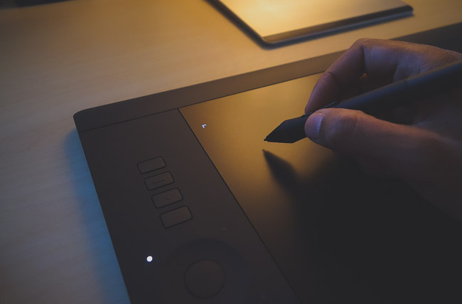
As such, given the repetitive and similar nature of it all, slight tweaks in behavior and optimizations of the tools at your disposal are enough to create a significant difference in efficiency. One primary way to immediately open up Photoshop in ways you can’t imagine without experience, is to get a pen tablet. If you’re going to do any amount or retouching in Photoshop, Lightroom, Capture One or Affinity Photo, just get one. I rarely push anyone to buy anything, but get one. Buy a used one, buy a cheap one, steal one from your neighbor…just get one.

And I mean it that you needn’t buy anything above the base models. I generally advocate getting a small Wacom Intuos with touch capacity, and that’s it. Yes, if you can get it get the Intuos Pro small, but it’s 3 times the price of the non-pro and you don’t NEED it. You can see a review of the Intuos Pen & Touch here, and the Intuos Pro here.

Using The Keyboard And/Or Tablet Keys For Max Efficiency

wacom-tablet-review-intuos-pro-photography-8

You can find numerous cheat-sheets for Photoshop online that tell you all the different hotkeys that exist for the program, but honestly, using them as anything but a reference when you forget something is a fool’s errand. It’s akin to sitting an open book exam, where frankly, if you don’t know the material you’re still screwed because you don’t have time to look it all up. The important thing is to remember a few essential keys and functions at a time, and that’s what we’ll do here, and present a few more a few days on.

wacom-tablet-review-intuos-pro-photography-10

Easy Tool Swap While Retouching

If you’re retouching on a broad level or a micro one, there are a few tools you’ll be using with the most frequency (typically):

Eyedropper Tool: i
Spot Healing/Healing Brush: J
Brush Tool: B
Clone Stamp Tool: S
Hand Tool: H

This list isn’t exactly definitive, but suffice to say we won’t qualify each statement. You can add to that list as you like but this tends to be what the list looks like for most people as they’re retouching people at least. But regardless of what your list is made up of, there’s likely a lot of switching back and forth between tools, and while the number of tools may not be exhaustive, the switching can be exhausting and time-consuming.

wacom-tablet-review-intuos-pro-photography-11

Hotkeys will cut your time here significantly if you remember the few you use most, because you can provisionally switch to the tool of your choice from the one you’re currently using simply by holding the hotkey for the desired tool during its use. So if you’re using the Brush tool (as we tend to for dodging and burning) but need to clone out something you would just press and hold ’S’ and your Brush will turn into the Clone Stamp tool, only to revert immediately back to the brush once you let go of the ’S’. Nice right? This is significantly faster than moving over to the tool panel clicking, using the new tool, then switching back. And if you have a Wacom tablet you can program the keys on the tablet to function as pretty much anything so you can do the same there.

Faster Zooming & Precision

Learning how to Photoshop faster is important if you’re a working photographer, but it’s an art, and needs a little time. Like writing a thesis or working on a painting, it’s typical to be so zoned in while you work that you become too close to the project to see it objectively. It’s why the greats take time, and advocate taking breaks. Hemingway would suggest finishing your writing with something left to say, completely stop thinking about it for the night, and then come back fresh in the morning. In retouching I advocate something similar but more easily done. Yes, it’s good to walk away and come back, but you should continually zoom out to see how your project is looking as a whole so you don’t lose the forest for the trees, so-to-speak.

adobe-photoshop-tutorial-faster-tips-tricks-intuos-wacom-2

adobe-photoshop-tutorial-faster-tips-tricks-intuos-wacom-5

Again, constantly zooming in and out can be tiresome and at the end of a project it can have taken away time and focus. The quick way to do it is to simply hold the ‘H’ key when you’re zoomed far in, and then move the pointer. Upon doing so the image will zoom out fully and a box will appear to show you the size of your current space (see image above), and you can then move that around if you like. Sure you could hold down the spacebar to drag the image but this is just so fast and allows for immediate checks of the entire image.

If you’re looking to learn more about Photoshop and how to wield it like you invented it, just a thought you may want to check these classes on CreativeLive which are up to 50% off at the moment.

How To Photoshop Faster | Simple Tips To Speed Up Your Photoshop Workflow Pt.2

$
0
0

Photoshop is just one of those programs that, once learned, is hard to do without, but perhaps a bit harder to get started. Without question there are huge advantages to be had through the structured rigor of some kind of Photoshop curriculum (check CreativeLive), but getting through such syllabus can often be overload, and as it turns out, there are probably a set of key tips that could not only have you using Photoshop more fully, but significantly faster and more accurately. This series is dedicated to help just that. You can find Part One here, and here are a few favorite Photoshop pieces worth your time:

Photoshop Tip | Split Your Screen For One Image To Maximize Efficiency

The Clone Stamp Tool | What Everyone Misses & Where To Find It

Get A Tablet

As photographers, most of us will live within similar Photoshop environments and do similar things, repeatedly. Given this repetitive and similar nature of it all, slight tweaks in behavior and optimizations of the tools at your disposal are enough to create a significant difference in efficiency. One primary way to immediately open up Photoshop in ways you can’t imagine without experience, is to use a pen tablet.

wacom-tablet-review-intuos-pro-photography-6

If you’re going to do any amount or retouching in Photoshop, Lightroom, Capture One or Affinity Photo, just get one. In fact, it’s an injustice to the software and yourself to pay for the software and not have a tablet. I rarely push anyone to buy anything, but get one; Buy a used one, buy a cheap one, steal one from your neighbor, panhandle …just get one.

And please understand that the investment needn’t be large, as the base models will suffice. I generally advocate getting a small Wacom Intuos with touch capacity, which will run you around $79. Yes, if you can get it get the Intuos Pro small, but it’s 3 times the price of the non-pro and you don’t NEED it. You can see a review of the Intuos Pen & Touch here, and the Intuos Pro here.

Reset Changes

I’ve spoken before about the immense amount of power and importance that’s been afforded the Alt/Opt key for Lightroom, and happy to say that within Photoshop it wields much authority also. In Lightroom it’s almost as is if any panel and tool and function has a duplicate function once the Alt/Opt key is depressed, and while it’s not quite so obvious is Photoshop, it’s there.

-intuos-tablet-5

One of the most critical and oft-used times it’s used is when reverting a tool or a dialogue box back to the original settings. If you’re opened up a new Levels, Curves or whatever layer and made some changes, only to discover you really don’t like what you’ve done, simply hold the Alt/Opt key and you’ll notice the ‘Cancel’ button will turn into a ‘Reset’, and once clicked, all changes you’ve made will essentially undo, and base settings will once again be present. The real power of Photoshop is in the layers so you’ll use them a lot and this can be great!

You can also use the Alt/Opt tool to see what’s on a particular layer. Say you’ve got a document with 10 layers and you want to see what is on a single one, hold the Alt/Opt button down and click the ‘eye’ and only that layer will be visible. Click it again and the others will show up again. It beats deselecting and selecting each layer individually.

Make A Dedicated Pen-Tool Button For ‘Undo’

wacom-intuos-pen-touch-tablet-retouching-lightroom-wedding-portrait-photography-slrlounge-kishore-sawh-9

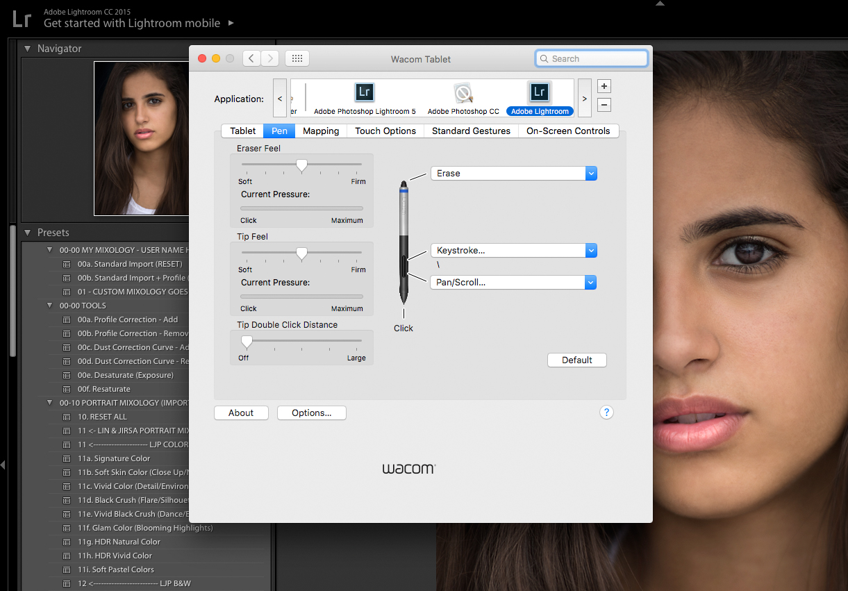
This is as simple as it sounds. If you’re using a pen tablet like a Wacom Intuos, learning how to optimally set it up for your retouching needs is key, and one suggestion is to set one of the buttons on the pen to function as ‘undo’. When you’re dodging and burning this is going to come in handy to no end, and in fact when doing anything else.

To do it, just go into your settings and under the pen tool assign the function – not much to it, but you won’t want to go without it.

Rotate For Accuracy

Possibly the most poignant thing anyone told me during any kind of formal art education came in AP art when my teacher instructed me to draw what was there, versus what I thought should be there. It’s subtle, but profound.

When drawing, say a head and face, we have an idea of what a head and face looks like; we know the general placement of eyes, and ears, and so on, until you realize you don’t. Most people won’t have analyzed a head enough to truly know proportions and relative distance of features etcetera, so what we end up with is off. The tip was to turn the object we were drawing upside down and draw that. What occurred is we disassociated what was there as a face, and simply as lines and shapes, and seeing it that way rids your mind of false assumptions.

-intuos-tablet-7

Consequently, you learn that rotating paper allows you to see things differently and to move your hand in a more natural way, and this is how rotating an image in Photoshop is good. If you’re dodging and burning especially, rotate the canvas so you can make the brushstrokes more natural. It’s particularly helpful when retouching people. Simply do it by pressing ‘R’ which will select the Rotate tool and you can turn it as you like. And no need to struggle to set it straight again, simply go to the top left and click the button that says ‘Reset View’ and you’ll be set.

3 Photoshop Tips To Stop You Ruining Your Photos. Do You Commit These Editing Sins?

$
0
0

Photoshop is a fantastic tool which can be used to transform your photography. It is also an incredibly complex program with many subtleties that may take you years to understand, though fortunately, there is an abundance of Photoshop editing tutorials available for free. Unfortunately, there are comparatively few resources which explain some of the fundamentals of Photoshop. It may be less glamorous but it is vitally important. If you do not understand the concepts I’ll be discussing today, I guarantee there will come a time when, to one degree or another, you ruin a photo.

Non-Destructive = Photoshop Editing Law

If you’ve been learning Photoshop for some time, then undoubtedly you’ll have heard the term ‘non-destructive editing’. At first, it may sound a little confusing, but I assure you it’s a very simple concept.

The easiest way to understand it is to first grasp destructive editing. Imagine you’re working in Photoshop, and you make a change directly on your photograph, let’s say you darken it using curves. Rather than making a separate curves adjustment layer, you directly edited that first layer (titled “Background” by default). You have just altered the original pixel data of your image. In other words, you have destroyed the original pixel data. Hence the term destructive editing. If you were to save the file, close Photoshop and re-open the document, those pixels would be forever altered.

photoshop-speed-psd-psb-tiff-retouching-portrait-wedding-workflow-compression-slrlounge-kishore-sawh-2

Conversely, as you may imagine, non-destructive editing focusing on the preservation of the original pixel data. You may make the same adjustment with your curves layer, as in our example, but by doing it as a separate adjustment layer, you can always revert back if need be. Here’re a few quick tips to help you work non-destructively from now on.

  1. Always add effects and adjustments to separate layers
  2. Use smart filters instead of applying filters directly to layers. Go to Filter > Convert for Smart Filter
  3. Should you need to make adjustments directly onto a layer, duplicate it first
  4. Keep an efficient workflow to help you avoid issues

So long as you keep to those, and always think about maintaining your original pixel data, you should be okay. It should be noted, however, that Smart Filters are wonderful for quick edits with a relatively small number of layers, but as soon as you start adding lots of layers Smart Filters will significantly slow things down. At that point, you need to start thinking outside the box.

[REWIND: DO YOU HAVE AN EFFECTIVE POST-PRODUCTION WORKFLOW?]

banding as a result of pushing and pulling file in photoshop

An Easy Way To Introduce Nasty Digital Artefacts

There’s a whole host of digital artifacts which poor Photoshop editing can introduce. If you don’t already know, digital artifacts is an umbrella term used to describe unwanted parts of our images, things like; excessive noise, color noise, banding, posterization, and so on. A very easy way to introduce some of these in Photoshop is by excessively pushing and pulling the tonal value of your photograph. In the example above, you can see the results of excessive adjustments to tonal values.

‘But hang on Max, I shot my photos in RAW so this doesn’t apply to me,’ you may say. Well, yes it does. Once you’ve passed through your RAW processor and entered Photoshop, you are no longer working on a RAW file. Photoshop is not a RAW editor, as many mistakenly believe. As such major tonal changes should be made before entering Photoshop. Alternatively, you could open your image as a Smart Object which will then allow you to continue making RAW adjustments by double clicking on the layer. To do so from Lightroom, right click on your image and got to Edit In > Open as Smart Object in Photoshop. From Adobe Camera Raw, hold Shift and you’ll see Open Image change to Open Object.

[REWIND: DOWN & DIRTY DODGE AND BURN TECHNIQUE USING ‘BLEND IF’]

Personally, I don’t tend to open my images as smart objects. Instead, I prefer to get the lighting right in camera and make any major adjustments in either Lightroom, Capture One, or ACR. However, it is useful to know should you wish to do so.

gradient showing example of banding with photoshop tips on how to avoid this

Your Bit Depth Makes A Difference!

Once inside Photoshop you can see what Bit Depth your document is by going to Image > Mode. However, you cannot convert an 8-bit image to 16-bit and still reap the benefits. That’s important to know.

Without delving too deeply into bit depth, as I have covered the topic before within this article, I will briefly explain what it is. Essentially, we have a choice to work with images which have more color data (16-bit) or less (8-bit). The difference between the two usually cannot be seen until you start making changes to your image. Once you do, you may find, if the changes are severe enough, that digital artifacts are introduced.

[REWIND: HOW TO REMOVE BANDING IN PHOTOSHOP]

The classic example is a gradient, like the one you see above. The nasty lines in that gradient are caused by the lack of information contained within an 8-bit file. I created the gradient, made severe adjustments using levels, and then made the opposite adjustment to bring the gradient back. The result is that it went from smooth to blocky and unattractive. Had the gradient began its life as a 16-bit image, you would not see the banding which has now been introduced, it would have remained smooth.

Does this mean you should always work in 16-bit? Yes and no. As there is so much more info contained in a 16-bit file, it can slow Photoshop down. As such, I tend to work in 16-bit until I am forced to convert over to 8-bit. Often this does not happen, but on the rare occasion it does I ensure all significant adjustments have been made before making the conversion.

Final Photoshop Tip And Summary

Given everything you have read today, you’d be forgiven for thinking that I am encouraging you to only make minor adjustments in Photoshop. That if you manipulate your images too much, you will ruin them. I am not. What I am simply saying is that Photoshop is a powerful editing tool which must be used in the correct way, if not you run the risk of ruining your images. If you’ve also been working destructively, then the damage could be irreparable.

As an example, I will take a RAW photo like you see above left, and transform it, along with others, into the final photo you can see on the right. My last Photoshop tip, therefore, is not to limit yourself; Photoshop is a tool which can be utilized to create almost anything. All I advise is using the correct approach.

Do you need to brush up on posing, camera techniques, lighting or editing in Lightroom? If you do, be sure to take a look at everything on offer in the SLR Lounge Store. There’s tons of first class education covering a broad range of topics. My advice would be to look at Photography 101, Lighting 101 and Lighting 201. If more than one of those interest you then maybe a Premium membership would be even better.

Photoshop Lightroom Tips | How to Create Camera Raw Presets From Lightroom Presets

$
0
0

Raw files contain nothing more than the unprocessed image data captured from your image sensor. To translate these files, there is a surplus of software solutions that can interpret the 1s and 0s into the image you captured, and Adobe came up with two. One is the default editor for most photographers, Lightroom. About 99% of the photo editing I do takes place in place in Lightroom and every once and while a photo needs a little finesse that can not be done within the confines of a catalog; that is where the second solution falls. Adobe Camera Raw (ACR) comes part of Photoshop itself, and both Lightroom and Camera Raw use the same processing engine to achieve the same results. However, plugins and presets are not directly compatible with each other.

[REWIND:3 PHOTOSHOP TIPS TO STOP YOU RUINING YOUR PHOTOS. DO YOU COMMIT THESE EDITING SINS?]
One of the biggest benefits of Lightroom is that it can apply my favorite presets automatically when I import my images, saving me time and makes my work consistent. Some of my favorite Lightroom presets, like the SLR Lounge’s Lightroom Presets CC, don’t come with Camera Raw counterparts; however, there is a workaround to import Lightroom presets that you already have and love into Camera Raw.

Apply the Preset

From Lightroom’s Develop Module apply the presets or mixology that you want to transfer into ACR. Here I applied of the Fuji 400h presets.

Abobe-Camera-Raw-Preset-Lightroom-Fuji-400h

Export to Photoshop

Choose Photo → Edit in → Open as Smart object in Photoshop. This will transfer the image along with the preset applied. From Photoshop. click on the Layers Pallet, this will open Camera Raw.

Abobe-Camera-Raw-Preset-Lightroom-Smart-Object

Abobe-Camera-Raw-Preset-Lightroom-ACR

Create the Preset

Click on the Presets tab and click on the Create New Preset (small button by the trash can bottom right) option. A dialogue box will appear with multiple options. Unclick – White Balance, Transform, Lens Profile, Chromatic Aberration, Lens Vignetting, and Camera Calibration. Rename the Preset to you liking. The preset will now be available from the Camera Raw panel.

Abobe-Camera-Raw-Preset-Lightroom-Preset

While most of the Lightroom adjustments in the Presets will be transferred, Graduated Filters and local adjustments will not, and keep in mind that like any preset, the effect will vary from photo to photo and will need fine tuning.

To get the most out of SLR Lounge’s Lightroom Preset System, check out our Lightroom Crash Course.

LIGHTROOM CRASH COURSE – THE ULTIMATE LIGHTROOM COURSE


3 Simple Steps to Give Your Subjects Amazing Eyes In Photoshop

$
0
0

Many can debate the ethical use of Photoshop, but if you strip down its use to a core idea, the editing software is meant to enhance imagery and emphasize the features through ingenuity in each image.

The age old phrase, “beauty is in the eye of the beholder” comes to mind as I watch Glyn Dewis’ video that teaches viewers how to use Photoshop to give your portrait subjects amazing eyes in three simple steps.

Step 1: Make a Selection Around the eye

Pinpoint your area of focus by selecting the eye as a whole using the Elliptical Marquee Tool, making sure to stay within the outline of the eye. Any modification in color or contrast made to the eye shouldn’t alter the clarity of the dark outline or the pupil. By pressing Q, you can create a Quick Mask Overlay that shows your desired selection, where you can remove any areas you don’t want to affect.

photoshop-tips-and-tricks

The harsh outline of the selection won’t blend seamlessly into the outer edges of the eye, this is where we need to feather out the selection to gradually fade the effect out. Under the Filter menu, select Blur > Gaussian Blur and dial in the pixel radius of the extent you wish to soften or feather out the selection. Now that you have fine-tuned the selection radius, focus on adjustments that will enhance the eyes.

Step 2: Blending & Color Adjustment

how-to-photoshop Using a Selective Color Adjustment Layer and switch the blend mode from Normal to Linear Dodge (Add), immediately you will see a jump in brightness and contrast from the original image. Adjust the Opacity of the effect by viewing the image in full to get a realistic idea of what the eyes should look like. This adjustment layer can be used to not only brighten the eyes but to tweak and emphasize color. By selecting various Color options under the Layer Properties, you can adjust color and contrast using the sliders. The key to these modifications is to intensify the look of the eyes while still maintaining a sense of realism, always remember to make small incremental changes to avoid any drastic alterations.

Step 3: Sharpening

Add a blank layer and sharpen to bring the eyes out of the shot and emphasize the minute details within the eye. Don’t forget to select ‘Sample All Layers’ to work non-destructively, being sure to leave the other layers that you have created unaffected by the sharpening tool.

photoshop-sharpening

Adjust the opacity to toggle back and forth and find a balance to show precise details within the eye.

See more of Glyn Dewis’s tutorials on YouTube and check out more of his work on Instagram.

4 Ways To Retouch Skin Color In Photoshop We Should All Know

$
0
0
These techniques are simple and effective. We should all know these four simple methods for adjusting skin color in Photoshop.

Product Photography | Why Everyone Knows You’re Not a Professional Product Photographer & How To Change

$
0
0
I look at a lot of product photography. From the amazing, to the, shall we say, less amazing. One thing that almost every amateur has in common is a lack of attention to detail. This article covers some vital steps you must take to ensure your photography is of a pro standard.

3 Methods For Precise Color Grading In Photoshop

$
0
0

When I think of Photoshop I think of precision and creativity. The RAW editors which many of you will be familiar with like Lightroom, Capture One, and so on, are wonderful tools but they lack the scope and precision of Photoshop; speaking generally, that is. Color grading is the process of altering the pre-existing colors within your image and through Photoshop we are able to gain very precise control of it.

This article will take you through three precise methods for color grading within Photoshop. I’ll be covering Hue & Saturation, Selective Color, and Apply Image.
using hue and saturation to color grade images in photoshop

Color Grading Using Hue And Saturation

Once you’ve created a Hue & Saturation layer, you’ll see a window similar to the one above. Compared to Selective Color, which I’ll demonstrate in a minute, there are two great features of Hue and Saturation; the Color Picker tool and the color range sliders. The Color Picker tool (the hand and arrows symbol) allows you to select a color to adjust simply by clicking on your image. While not ground-breaking it’s a useful feature, especially if you’re unsure which color to adjust. The color range sliders at the bottom of the panel allow you to refine your selection and precisely target one particular color, or even just a few shades of a particular color.

Side note – When making adjustments to the color range sliders, I often drag the saturation to 100 so I can see exactly what I’m selecting. Check out this article for a more detailed explanation.

[REWIND: COLOR GRADING IN PHOTOSHOP | 5 WAYS TO MANIPULATE COLOR]

explanation of the hue and saturation panel in terms of color grading

For demonstration purposes, I thought I’d color-grade the trees a little, making them more green, and more yellow. To do so, I grabbed the color picker tool and clicked on the trees. This showed me that, in fact, there was more yellow in the trees than green, and hence, the Yellow channel was selected. From here I made adjustments to the Hue and saturation sliders until I was happy with the result. I rarely touch the luminosity slider but don’t be afraid to do so should you like the effect.

two possible color grades using hue and saturation

Using Selective Color For Very Precise Color Grading

Selective Color dwarfs most other adjustment layers when it comes to color grading control. Not only can you independently adjust the reds, yellows, cyans, blues, and magenta’s, but you can make more global alterations to the highlights, mid-tones, and shadows. In addition, whereas Hue and Saturation give us the one slider to control the Hue, you’ll find three sliders in Selective Color which provide a far deeper level of control.

[REWIND: 4 WAYS TO RETOUCH SKIN COLOR IN PHOTOSHOP WE SHOULD ALL KNOW]

all the different possibilities for color grading using selective color

If you’re familiar with adjusting color in Curves, then Selective Color is quite similar but in slider form. The easiest way for you to learn is to open up Photoshop and have a play. You’ll notice that each slider has a name; Cyan, Magenta and Yellow. Moving the slider to the right will introduce that color, moving it to the left will introduce its opposite. Cyan > Red, Magenta > Green and Yellow > Blue. Finally, you’ll also notice a slider titled ‘Black’. This works in a similar way to Luminosity in Hue and Saturation but, in my experience, tends to work a little better.

the selective color panel in photoshop

So why use selective Color over Hue & Saturation? Both are quite similar but Selective Color is more precise in terms of your control over each color. As you’re given three sliders to control the given color of each channel, you have much more control, as well as the fact Selective Color brings the additional control to Highlights (Whites), Midtones (Neutrals), and Shadows (Blacks). It’s certainly not the quickest of Photoshop’s color grading tools,but it is one of the best for control freaks like me.

Apply Image, A Color Grading Curve Ball

Using Apply Image you can create extremely precise masks which you can use to apply your color grades to the highlights or shadows. Hang on Max, aren’t you just repeating yourself here? Didn’t you just say we can do that using Selective Color? Yes, I did, BUT you can have even more control by using Apply Image. Let me first show you how to do it and then I’ll say why it’s great for added control.

the masks created using apply image in photoshop

Create a new layer, I often use Curves here, and go to Image > Apply Image. You’ll be presented with a window similar to the one below. Your source will be the name of the image you have open. For our purposes today, leave Layer as ‘Merged’, Channel as ‘RGB’ and Blending as ‘Normal’. The only setting I want you to alter is Invert. With it ticked, you’ll create a mask for the Highlights, un-ticked and your mask will be for the Shadows. The two masks you can see above are what will result from this method.

how to find apply image in photoshop

using apply image to color grade in photoshop

The reason this is better than Selective Color is because you can make further refinements to the mask. Let’s take the shadows in the example image. Selective Color will allow you to adjust the Shadows but as a large portion of this image would be contained within the shadows, you’d be making a very global adjustment. Using the mask Apply Image has created for us, we can edit that mask using CTRL or CMD + M/L (for curves or Levels) and narrow down our selection even further.

Side note – Apply Image is a very powerful technique which can be applied to many things. For example, you could use the same masks to make precise adjustments to tones.

uisng blend if to color grade in photoshop

A Little Bonus For The Control Freaks Out there

On any of the adjustment layers you create, if you decide you’d like to quickly limit their effect to either the Highlights or Shadows, double click on them and use ‘Blend If’. By alt-clicking on the sliders, they split (see photo above), this allows you to taper the effect off, gradually removing it from either the Highlights or Shadows. This technique is one I use all the time; it’s quick and easy to get your head around.

3 Precise Methods For Color Grading In Photoshop

Color Grading Summary

You don’t always need this level of control when color grading. More often than not, I make more global changes to the Highlights, Midtones and Shadows from inside a RAW editor. However, if you have the time to spend on an image, or want to make very precise alterations for whatever reason, then the methods covered today will come in very handy.

[REWIND: 3 IMPORTANT WAYS TO EDIT COLOR IN LIGHTROOM]

Depending on the job, one of my favorite ways to color grade an image is by using the SLR Lounge Preset System. I’ve been using it for years and find it to be a versatile tool which allows me to quickly achieve very pleasing results, you can find it here. If you’re contemplating becoming a premium member, then bear in mind that the preset system is thrown in for free! Click here to check out our Premium Membership.

2 Second Technique To Whiten Teeth In Photoshop | Plus A Free Action

$
0
0

Whitening teeth in Photoshop is one of those things that all portrait photographers will all have to do at some point. When making alterations such as these, I always feel it necessary to point out that a light touch is usually best. It may seem obvious to some but I guarantee we’ve all seen some overdone images in which the teeth look so white they glow. If you think I’ve just described your images, stop now, it’s not a good look.

[REWIND: RAMBLINGS ABOUT RETOUCHING | IS “I’LL FIX IT IN POST” STILL A DIRTY PHRASE?]

The lengths to which we deem retouching to be acceptable will vary,  and check out this recent article in which I discuss just that. However, regardless of subjective boundaries, I think we all have the same initial aim in mind: “I want to make my subject look better”. In my opinion, taking things like teeth-whitening too far has the opposite effect. Your subject WILL look worse. Rant aside, let’s get going with this 2-second teeth whitening technique.

How To Retouch Teeth In Photoshop In 2 seconds

The two second part of this teeth whitening technique is kinda cheating: use my action. All the action does is set everything up for you. Once run, you’ll end up with a few layers which will work the majority of the time. All you have to do is paint the effect onto the teeth in question.

the different layers used in photoshop to create the teeth whitening effect

Even though you could simply use the action and forget, I’m still going to take you through the setup. Why? Well, firstly it’s important for you to know how this stuff works. If you only ever rely on actions, you’ll never learn anything. You’ll always be asking, is there an action for this? Secondly, to get the most out of this method, you’ll need to make some little adjustments once the action has run.

How The Teeth Whitening Works

If you were paying attention at the beginning, you’d know that I take a less is more approach to retouching. I want my subject to remain who they are and look real. In certain circumstances, you may be asked to aim for perfection, but I always start with what’s natural and go from there. As such, you’ll notice a layer called “more whitening”. If you feel you want, you guessed it, more whitening, increase the opacity of that layer.

[REWIND: 4 WAYS TO RETOUCH SKIN COLOR IN PHOTOSHOP WE SHOULD ALL KNOW]

The “More Whitening” layer contains a blank, white layer, using the blend mode ‘Soft Light’. The effect has been made more natural by removing it from the shadows. To do so, I used Blend If. You can access the Blend If controls by double clicking on your layer, which will take you to the Layer Styles dialogue. By ‘ALT-clicking’ on the sliders at the bottom, you are able to gradually remove the effect from either the Shadows or Highlights. The final effect of this layer is controlled by opacity.

the blend if section of the layer styles panel used to refine the teeth whitening

Removing The Yellow And Making It Look Natural

To remove the yellow, I add a Hue and Saturation layer. The master saturation is dropped a tad (-5) but the main adjustment is made within the yellow channel. By removing the majority of the yellow saturation teeth begin to look more white. Be careful here. De-saturate too much and you’re left with gray. I find -40 works most of the time but you may need to increase it slightly depending on the severity of the color. By adding a small amount Lightness the teeth take on a natural brightness.

the hue and saturation panel on the yellow channel. adjusting this for teeth whitening

The final step I take to whiten teeth in Photoshop is to add a Levels layer. If you simply desaturate the yellows it won’t look natural. I can’t give you a definitive answer as to why this is, perhaps it’s because whiter teeth will reflect light differently, not sure. Whatever it may be I find that boosting the highlights makes a big difference. However, it’s important to temper this boost with a slight darkening of the mid-tones. If not, it looks fake.

the levels panel being used to brighten teeth in photoshop

If you feel you need an extra boost to the whitening, I’d suggest increasing the effect of the Levels layer and / or tweaking the sliders in Blend If on the “More Whitening layer.

three different stages of teeth whitening in photoshop using different methods

Teeth Whitening Summary And Action Download

Keep it real. Unless you’re being told what to do by a client, try to have a natural approach to retouching. Maybe it’s just me, but I can’t stand portraits that look fake. I have no issue with people who make significant edits but you’ve got to keep people looking real. Plastic skin, over whitened teeth, crazy eyes, and so on are just some of the telltale signs of over-editing.

To download the free action, click here. To install it in Photoshop, all you have to do is drag it into your Actions panel.

[REWIND: IMAGE DECONSTRUCTED | HOW TO SHOOT & RETOUCH A CLASSIC FASHION LOOK BY STEVEN MEISEL]

Have you seen SLR Lounge Premium yet? If you like the education offered here then I highly encourage you to check it out. It’s a fantastic service which includes a massive amount of educational content for photographers of all levels. Find it here.

Viewing all 349 articles
Browse latest View live